How do you create a classroom library?
I am so proud to have developed, designed, and launched the new Educational Epiphany Continuing Literacy Collection. This thematically-aligned classroom library for Grades 3 – 8 pairs informational and literary texts with meaningful topics and themes to:
- inspire curiosity
- reinforce essential developmentally appropriate literacy concepts
- build literacy skills
Product Design
This project combined my twin passions: design and data. I got to use my design and visual storytelling skills AFTER I had methodically and mathematically mapped out and planned the product. While the content team focused on topic, book type, genre, Lexile® range, and critical concepts to be incorporated into each manuscript, I developed a design system to accommodate:
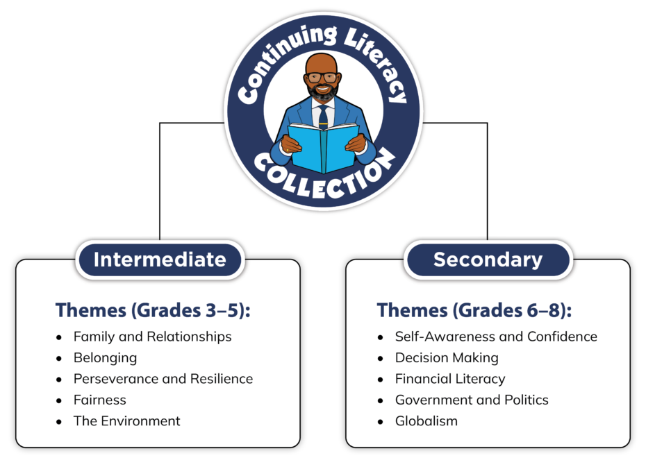
- 2 collections: Intermediate (Grades 3–5) and Secondary (Grades 6–8)
- 30 books per collection (60 books in total)
- 5 informational texts per grade-level
- 5 literary texts per grade-level
- 5 themes per collection
- Defined word counts per grade
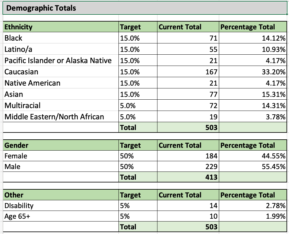
- Demographic targets for ethnicity, gender, and age
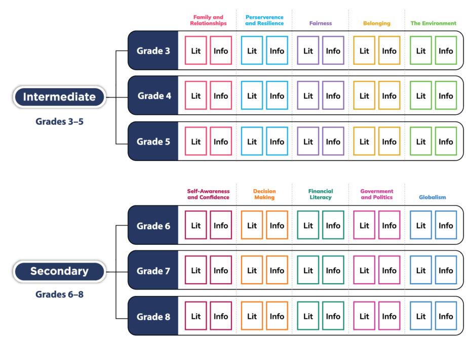
Themes
Grade-level themes were established to introduce and reinforce essential developmentally appropriate literacy concepts. Connecting informational and literary texts through meaningful topics and themes, students are given the tools they need to reach and exceed reading proficiency.
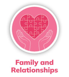
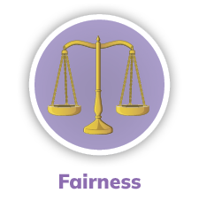
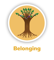
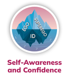
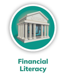
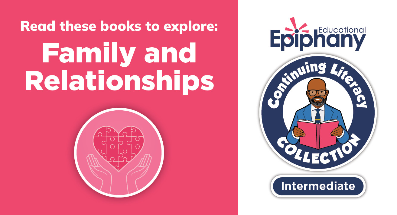
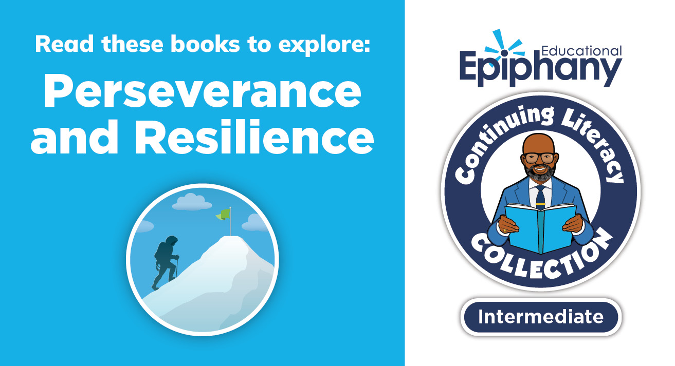
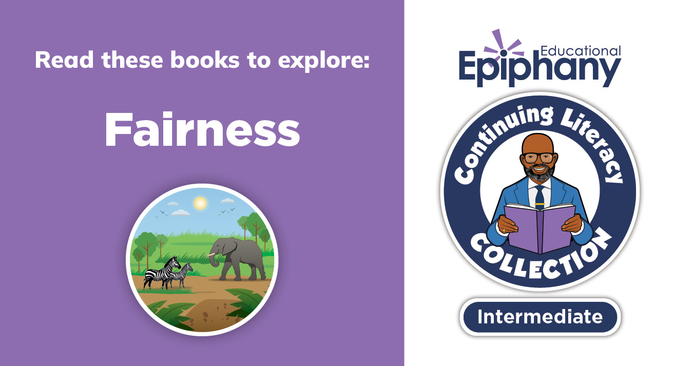
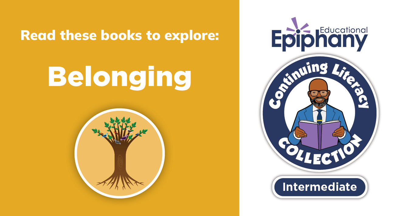
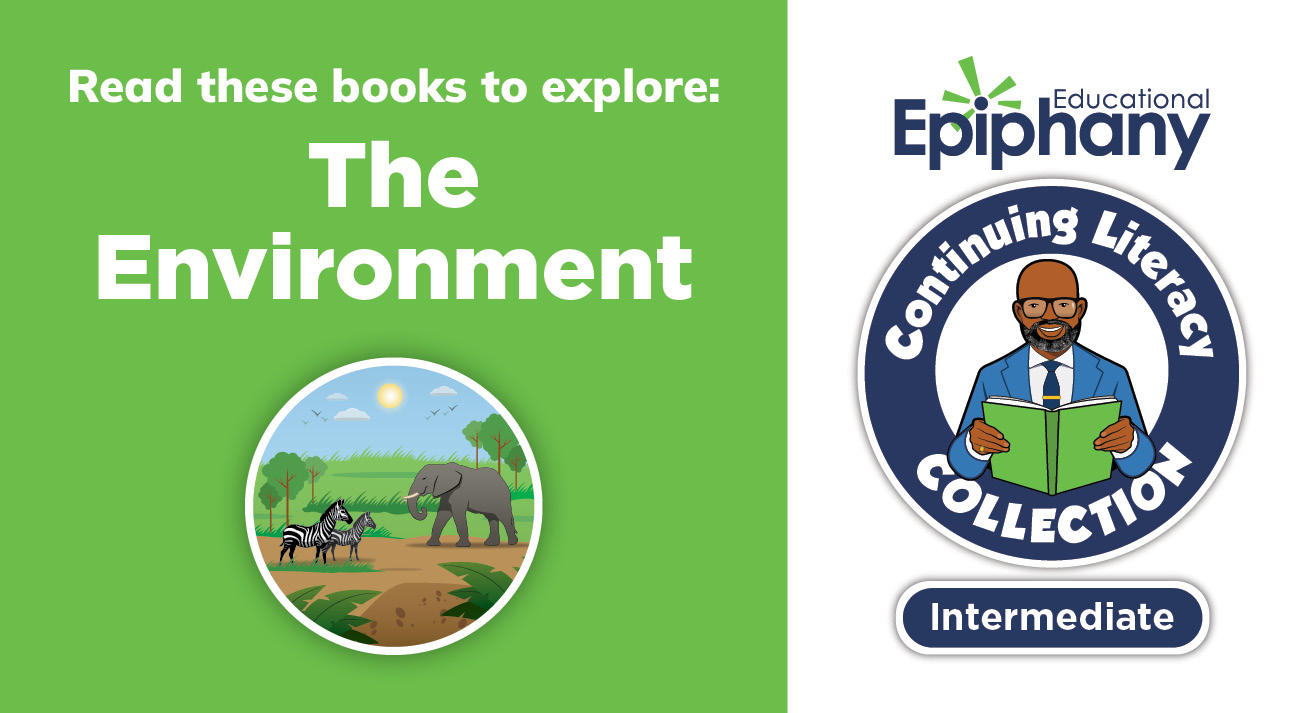
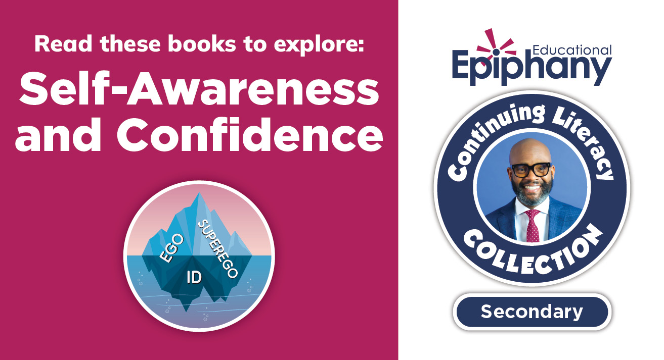
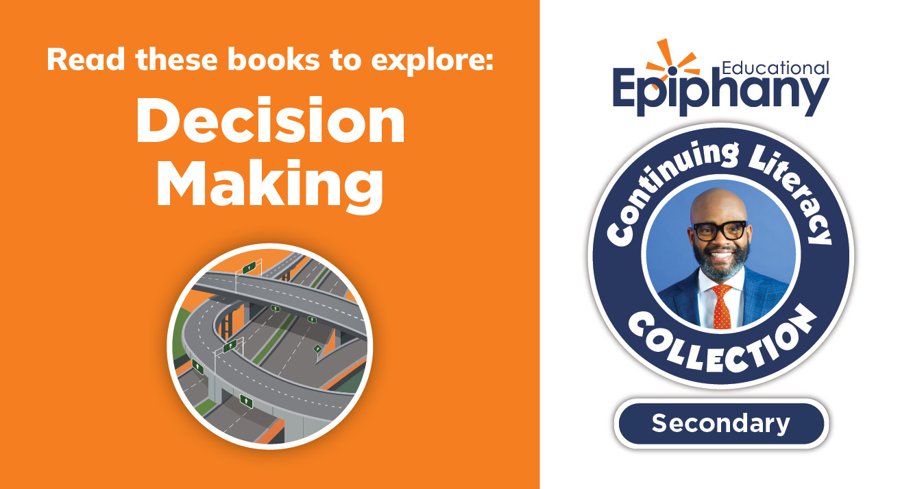
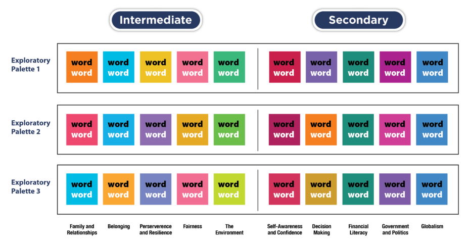
It was determined that the books would be identified by the theme, rather than by grade-level. This would empower students of all ages and all levels of reading proficiency to explore the texts by subject area and interest. I recommended that each theme be assigned a unique color and a corresponding illustration that would serve as visual identifiers to differentiate the books and help teachers and students navigate the collection.
I worked with illustrator Darrin Pepe to create unique illustrations that convey the key concept of each theme symbolically while adding visual interest. Each illustration served the dual purpose of appearing:
- individually with color-coded labeling (icon)
- as part of a larger theme infographic (wedge)
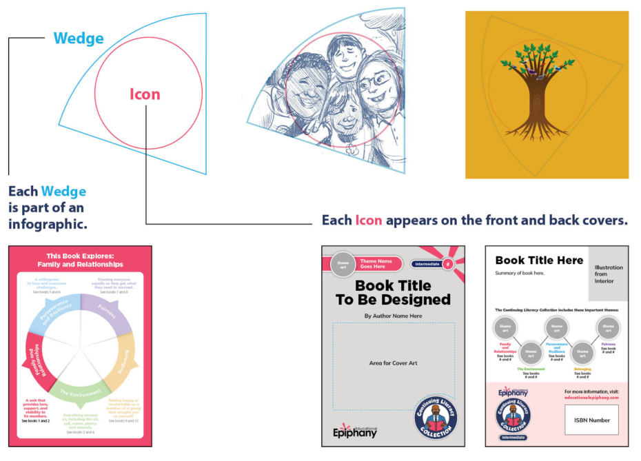
Theme Icon
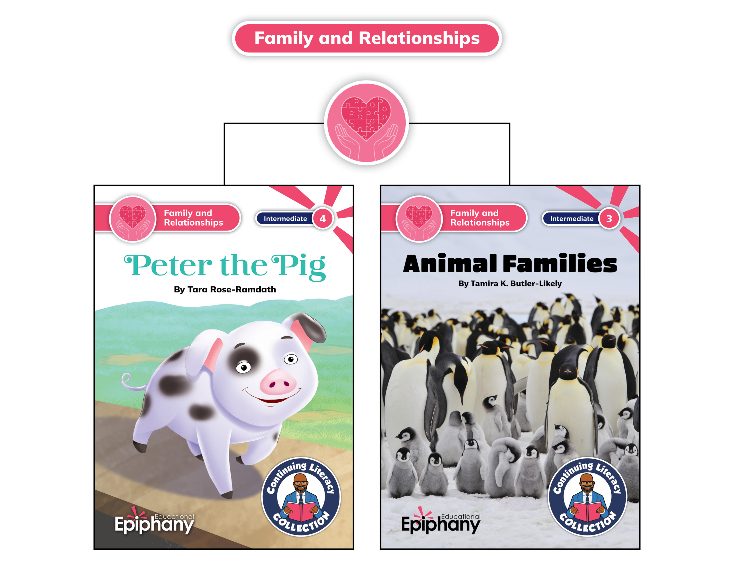
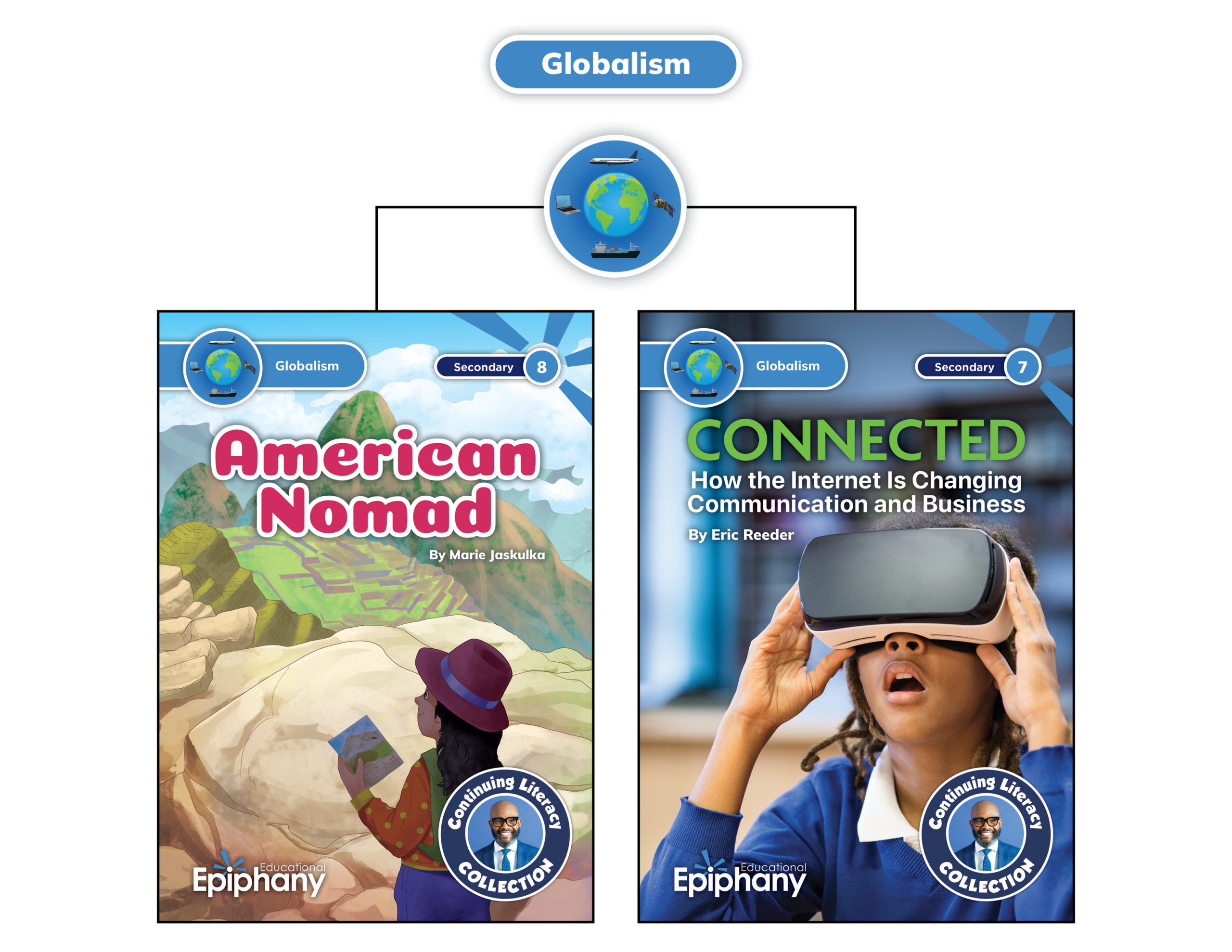
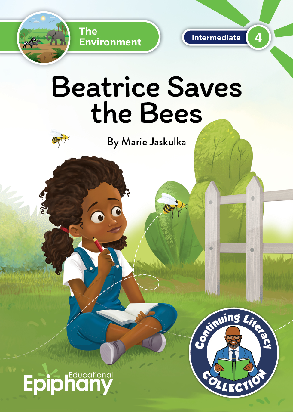
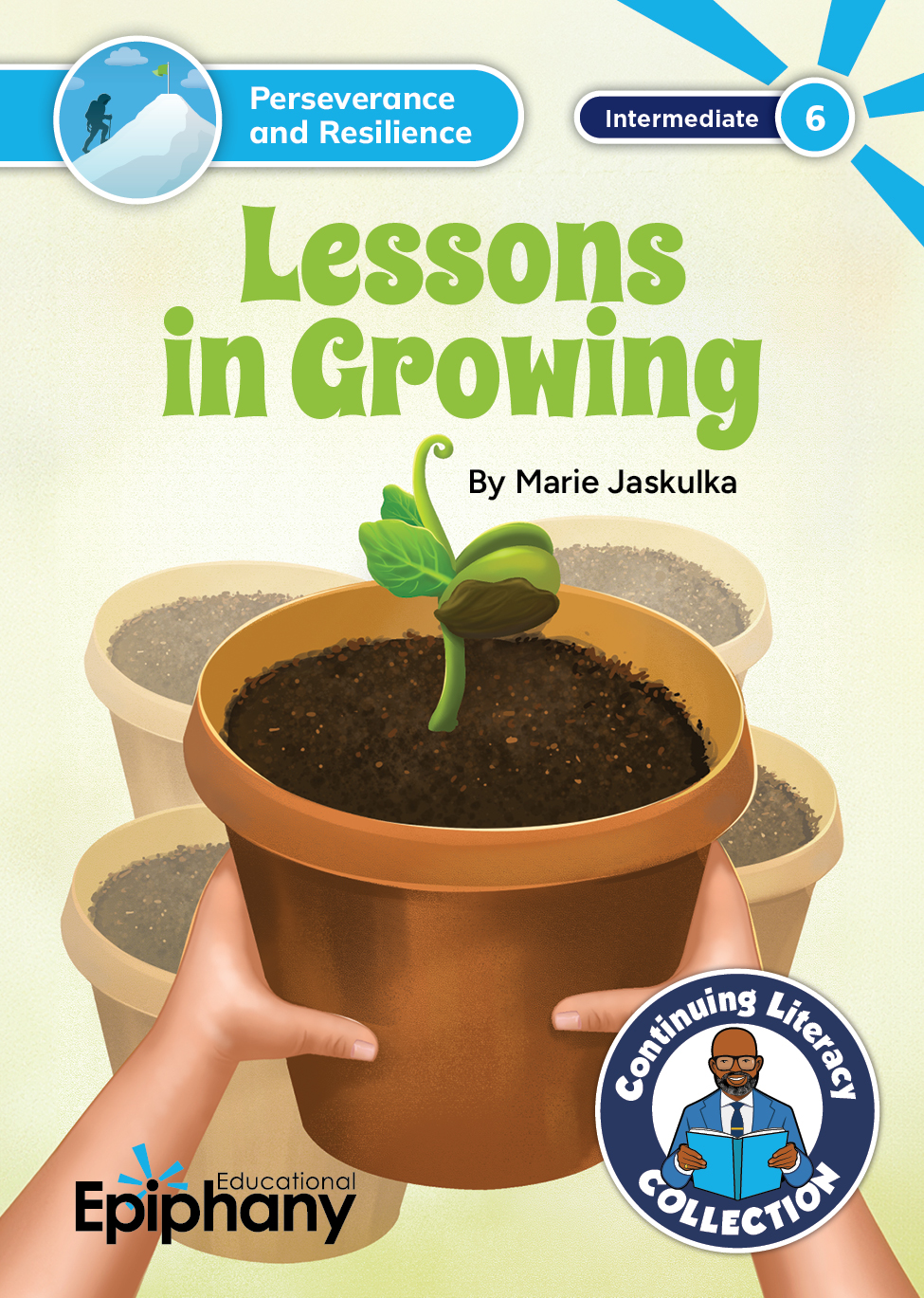
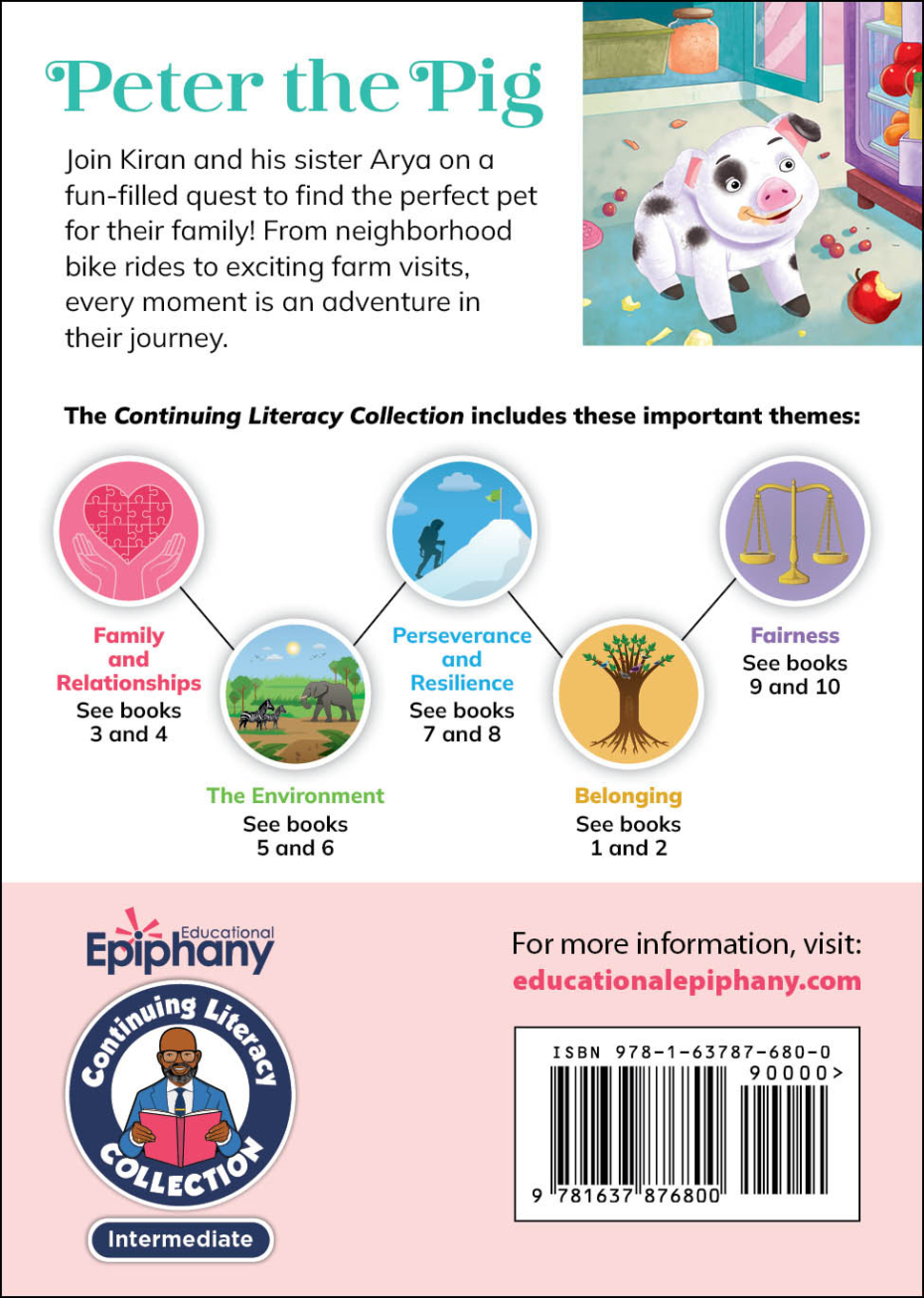
One illustration, accompanied by a color-coded text label, appears on the front of each book cover to identify the theme of the book. The same illustration appears on the back of each book in a grouping that shows all of the themes included in the grade-level collection. The theme is reinforced in other elements including book number, logos, and URL.

Theme Wedge
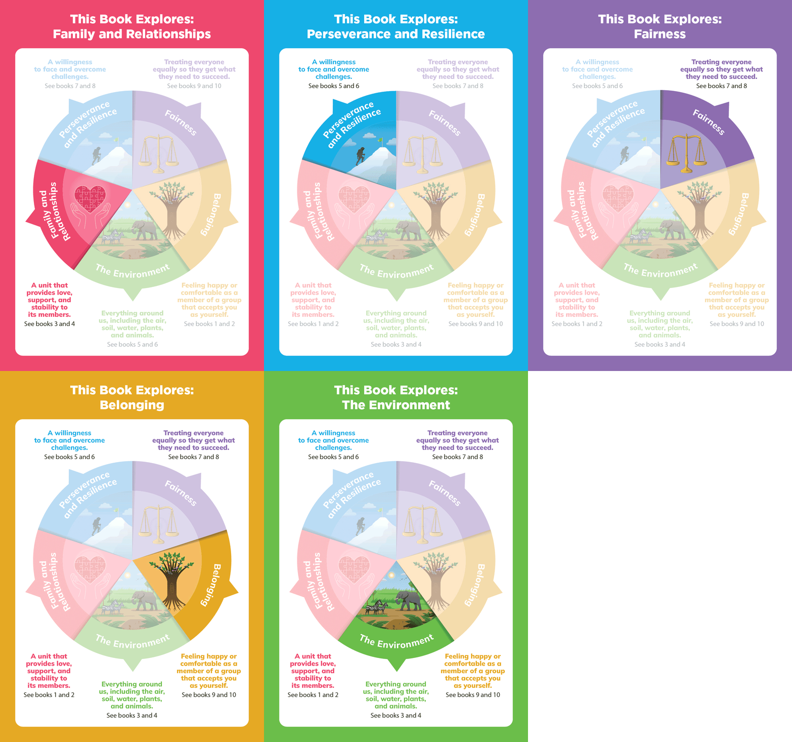
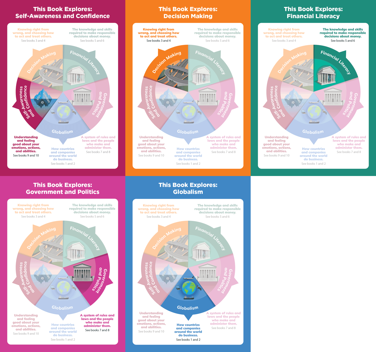
Five wedge-shaped theme illustrations are combined to create an infographic that appears on the inside front cover of each book to:
- emphasize which theme each book will explore
- indicate all themes covered per grade-level collection
- provide students with definitions for each theme
Brand Identity
Logo Design
After exploring a variety of logo concepts, it was decided that the product should have a visual connection to an existing product, Dr. Dickey’s Decodables.
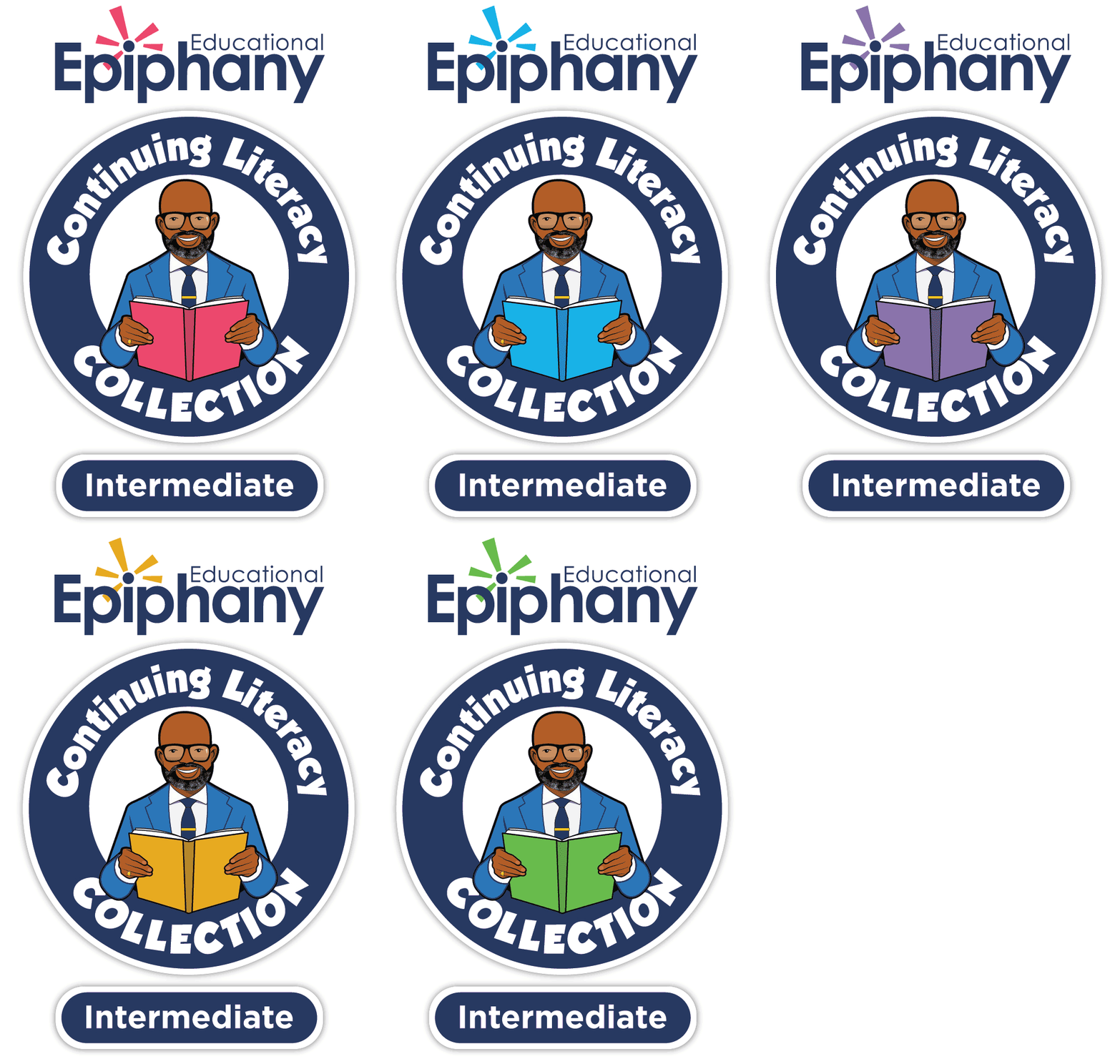
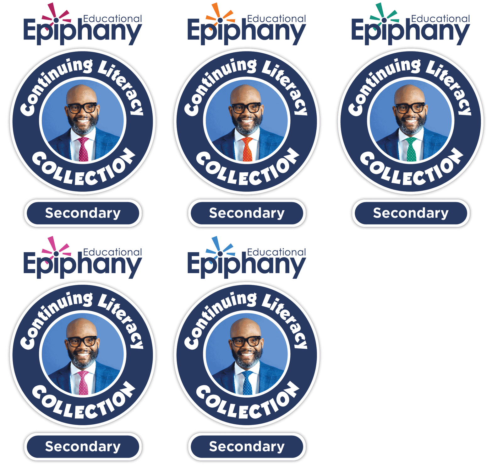
Because there were two grade-level collections (Intermediate and Secondary), I wanted the logos to differentiate the collections. To visually represent the age ranges for each collection, we decided to use illustration for the younger grades and photography for the older grades. Intermediate Grades 3–5 would feature an avatar of Dr. Dickey; Secondary Grades 6–8 would feature his portrait.
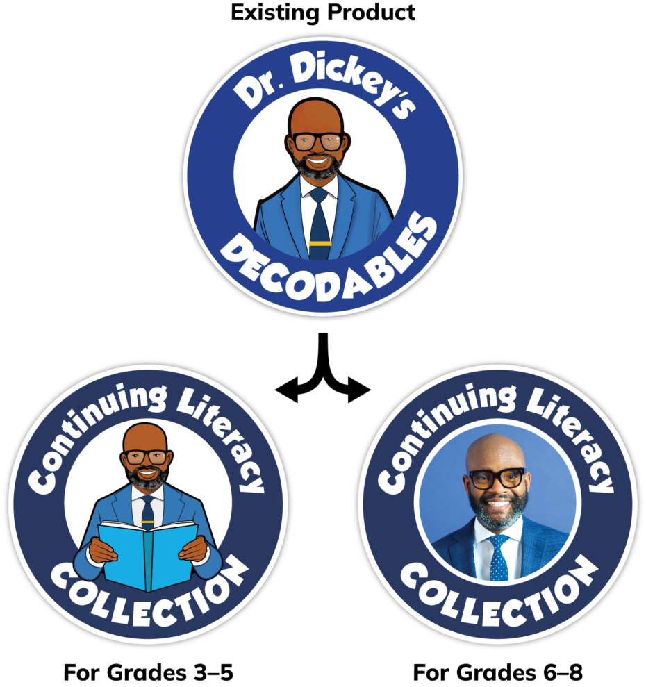
I designed the logo to contain three elements that could be used independently or combined as a unit:
- brand logo (top)
- product logo (middle)
- grade-level identifier (bottom)
Because the collection was organized by theme, I color-coded the logo to correspond with and emphasize each theme.
Content Development
Tailored to meet the developmental needs and interests of both elementary and middle school students, the library introduces and reinforces universal literacy concepts including: citing textual evidence, drawing inferences, determining main topic, main idea, central idea, and theme, summarizing, analyzing relationships between and among individuals, events, and ideas, analyzing the relationship between characters, setting, and plot, text features, text structures, determining author’s purpose, point of view, and author’s argument.
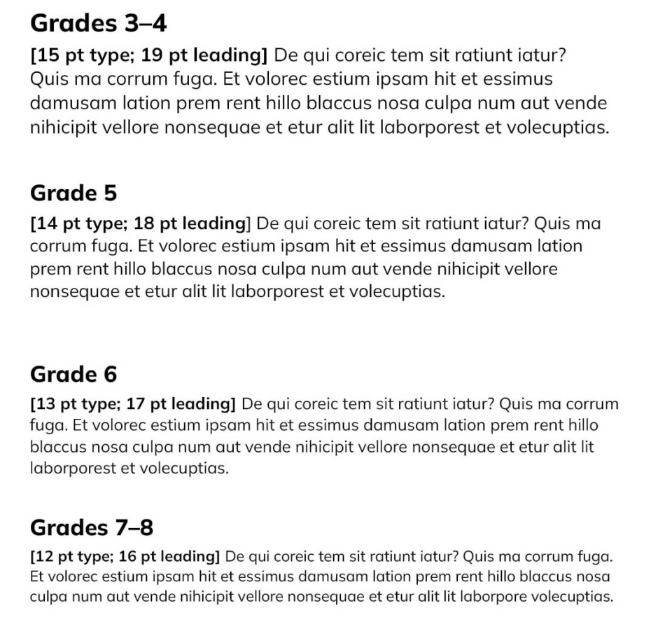
The content team carefully estimated word and page counts per grade, which I used to explore typography and determine grade-appropriate font sizes. We decided not to label the books by grade level, as it can restrict access to materials and discourage browsing. We did, however, typeset the text by grade-level font size based on word and page counts.
Diverse topics and engaging themes were selected to broaden students’ background knowledge, empowering them to navigate unfamiliar texts with confidence.
Goals included:
- keeping students interested and invested in reading
- helping students navigate both academic and personal challenges with resilience and empathy
- encouraging civic responsibility
- supporting all readers, no matter they are in their literacy journey
We developed a paired text approach (fiction and nonfiction) to promote mastery of comprehension skills by exposing students to a variety of text types, forging meaningful connections between literacy concepts and opportunities for text-based inquiry and critical thinking. Two text types per theme provided diverse learning opportunities that catered to a range of preferences and reading abilities.
Demographics
Students in the United States come from a large and increasing number of racially, ethnically, culturally, and linguistically diverse families. To ensure that the library reflects the diversity of the country’s student population, we worked with our content team to ensure that authors and illustrators presented multicultural perspectives and encouraged global awareness.
Literary Texts
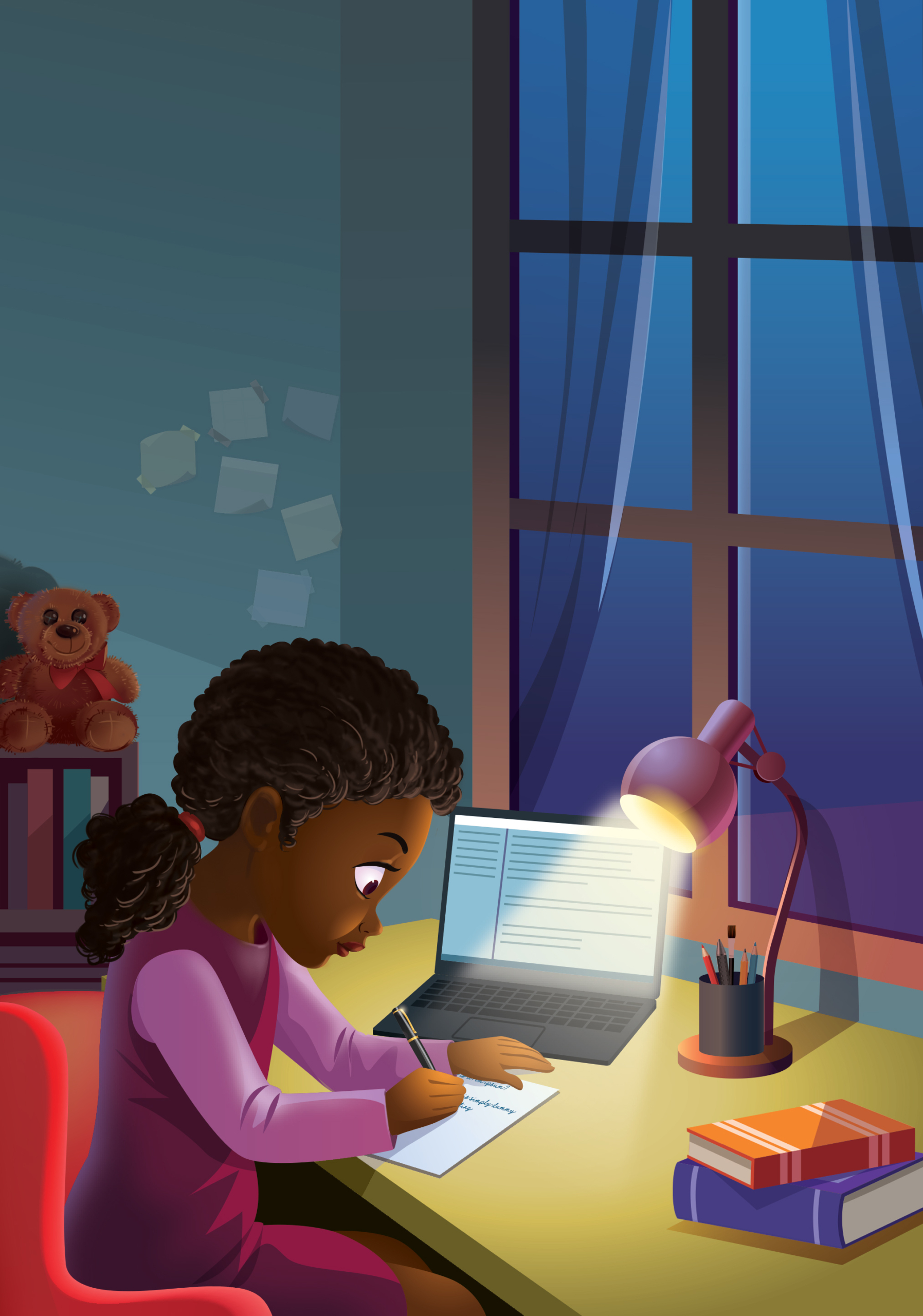
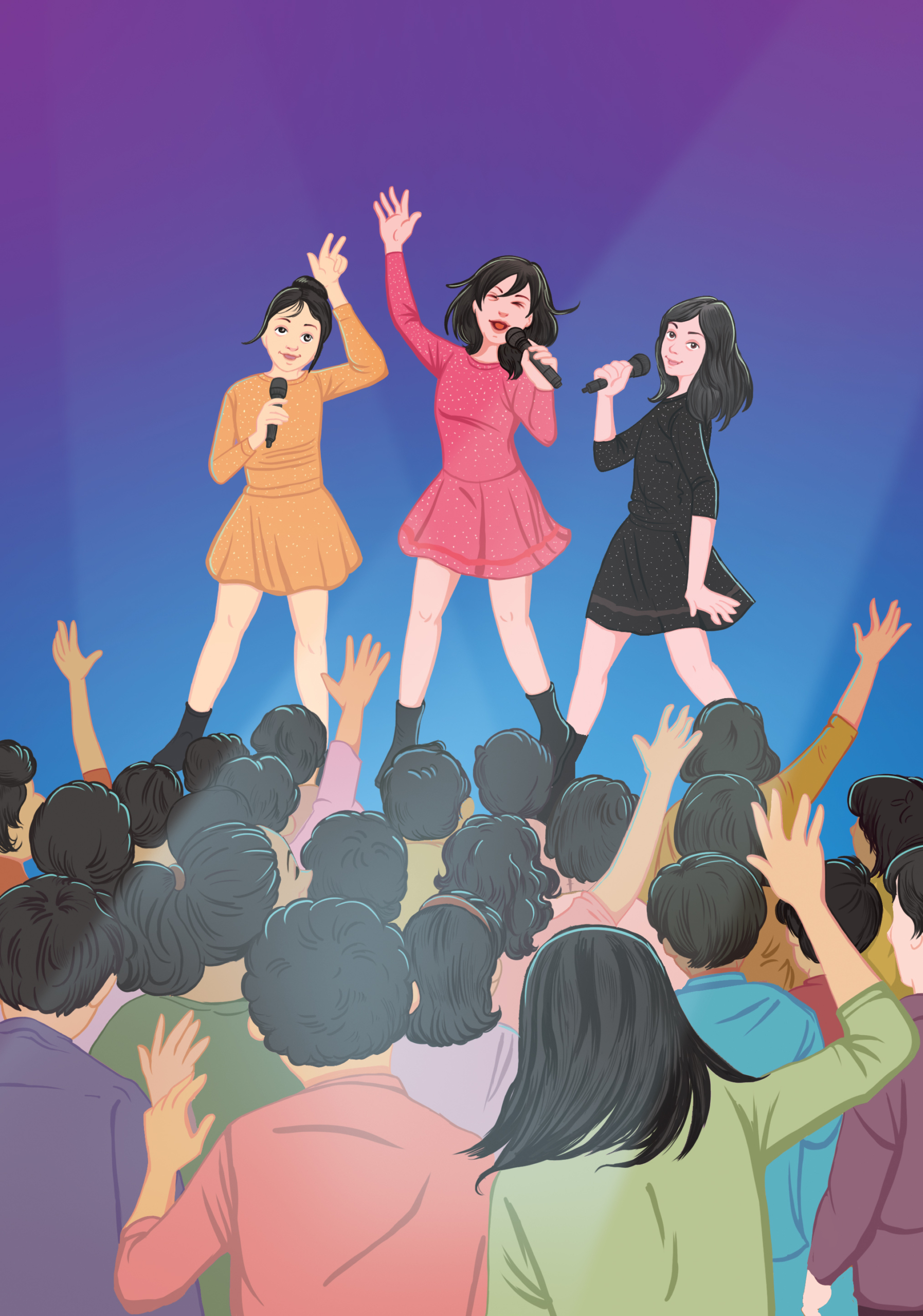
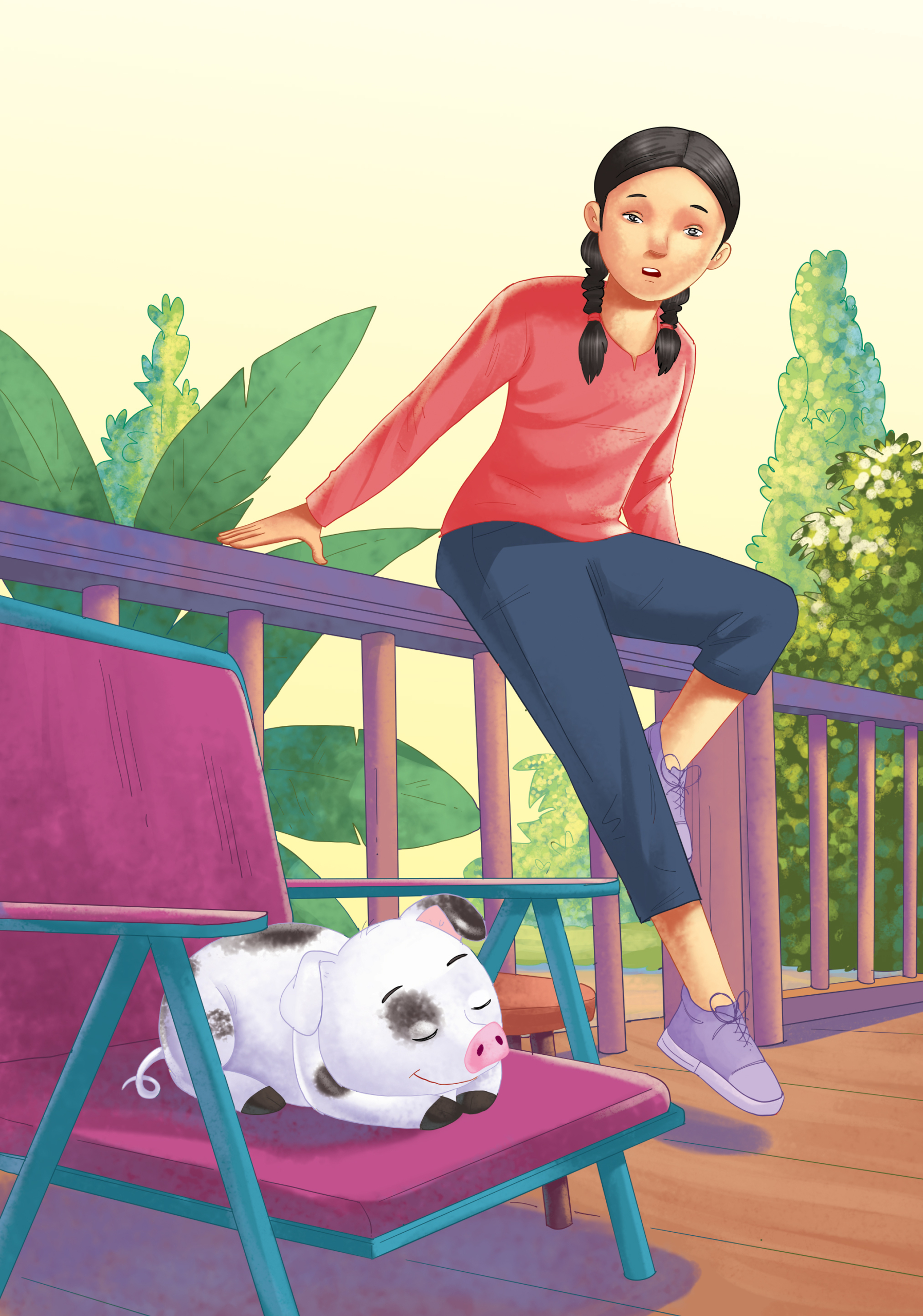
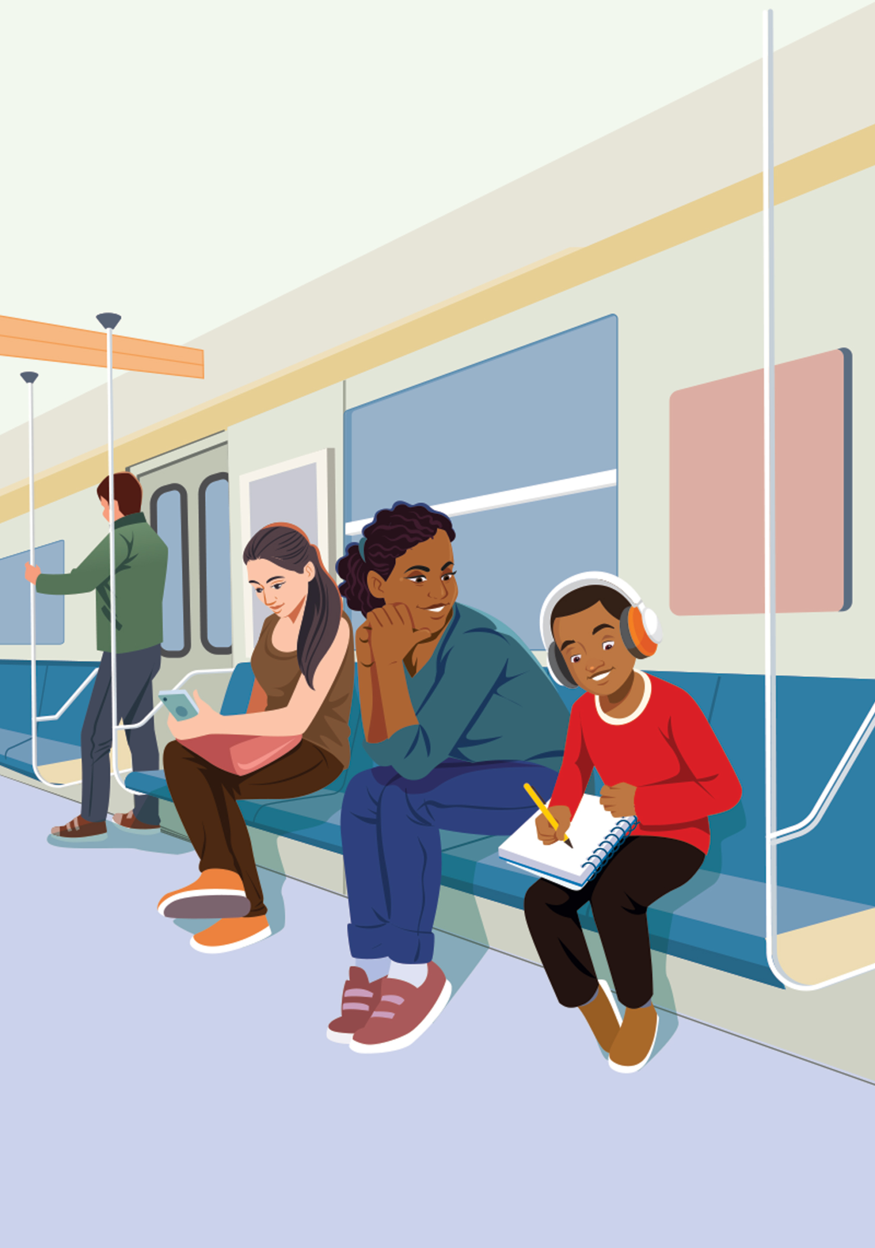
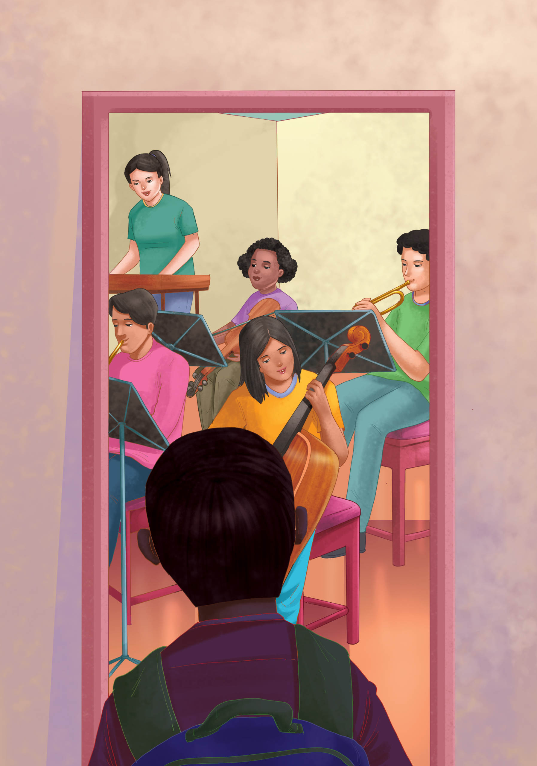
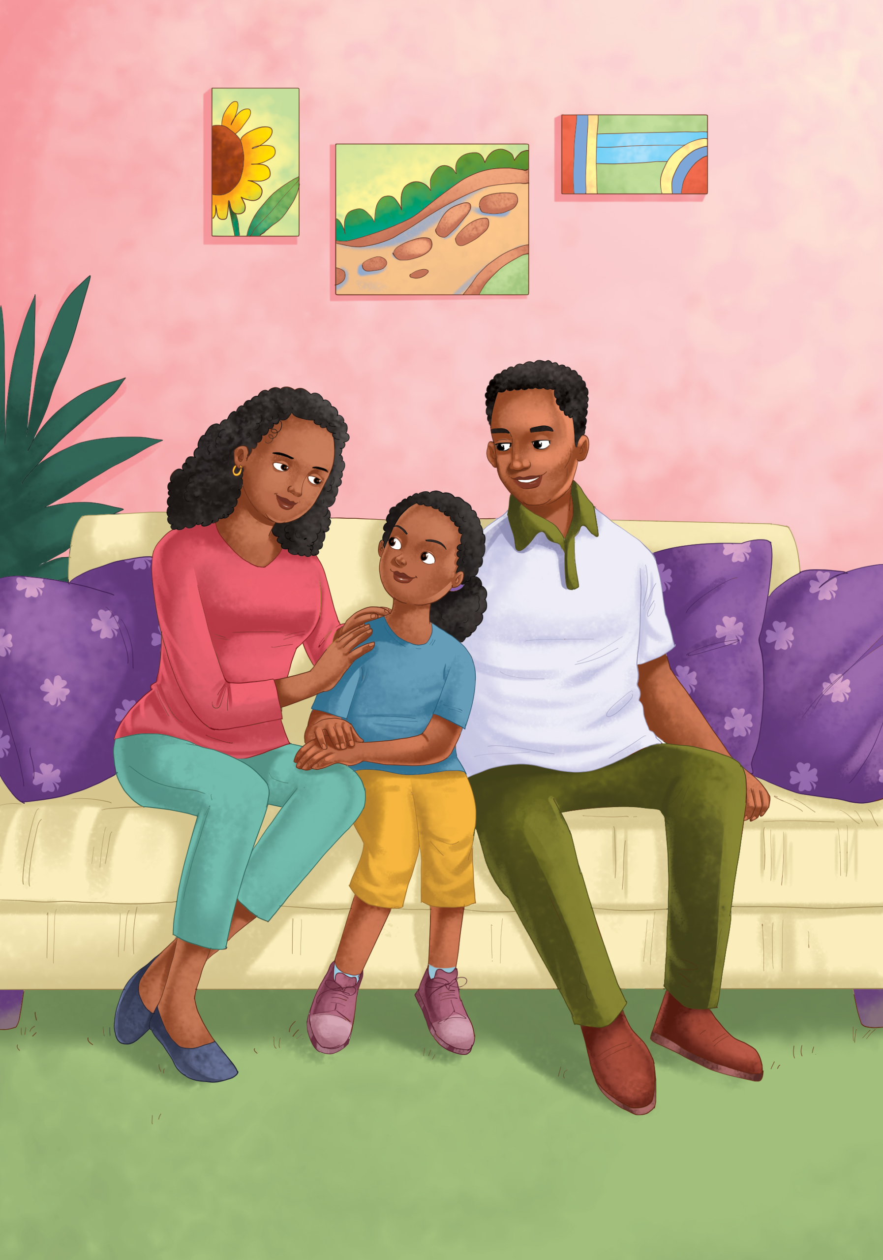
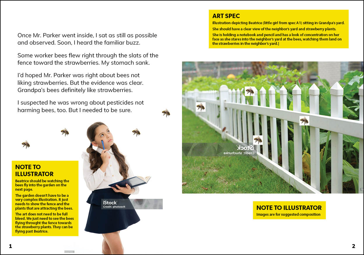
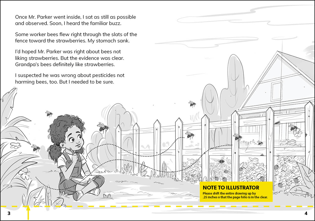
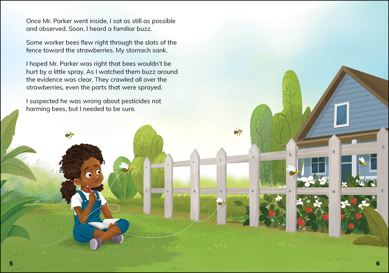
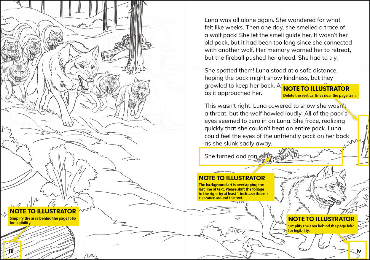
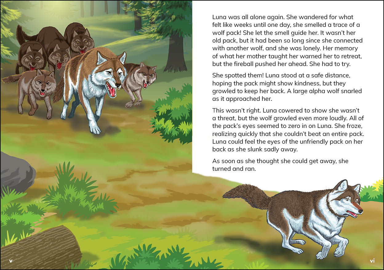
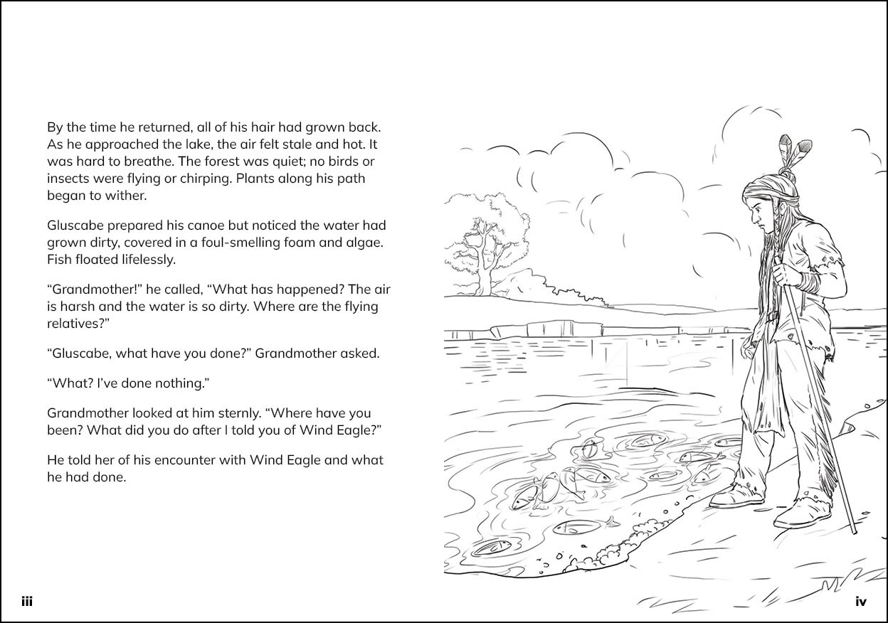
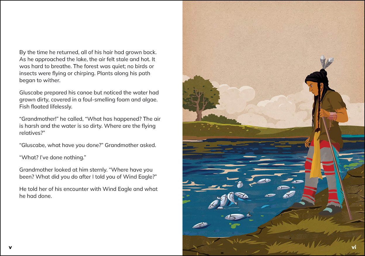
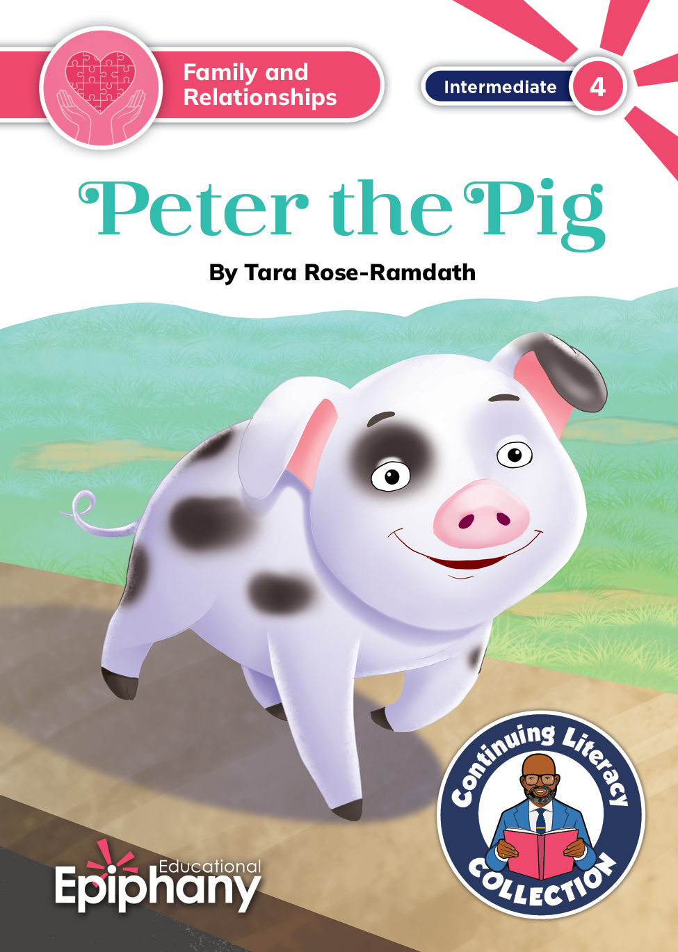
We decided that our literary (fiction) books, which included folktales, legends, fables, poems, and plays would be illustrated. The authors provided preliminary art specs, which I either enhanced or supplemented. I art directed a team of illustrators who turned the words into meaningful and engaging works of art. I hope students love the artwork as much as we did.
Informational Texts
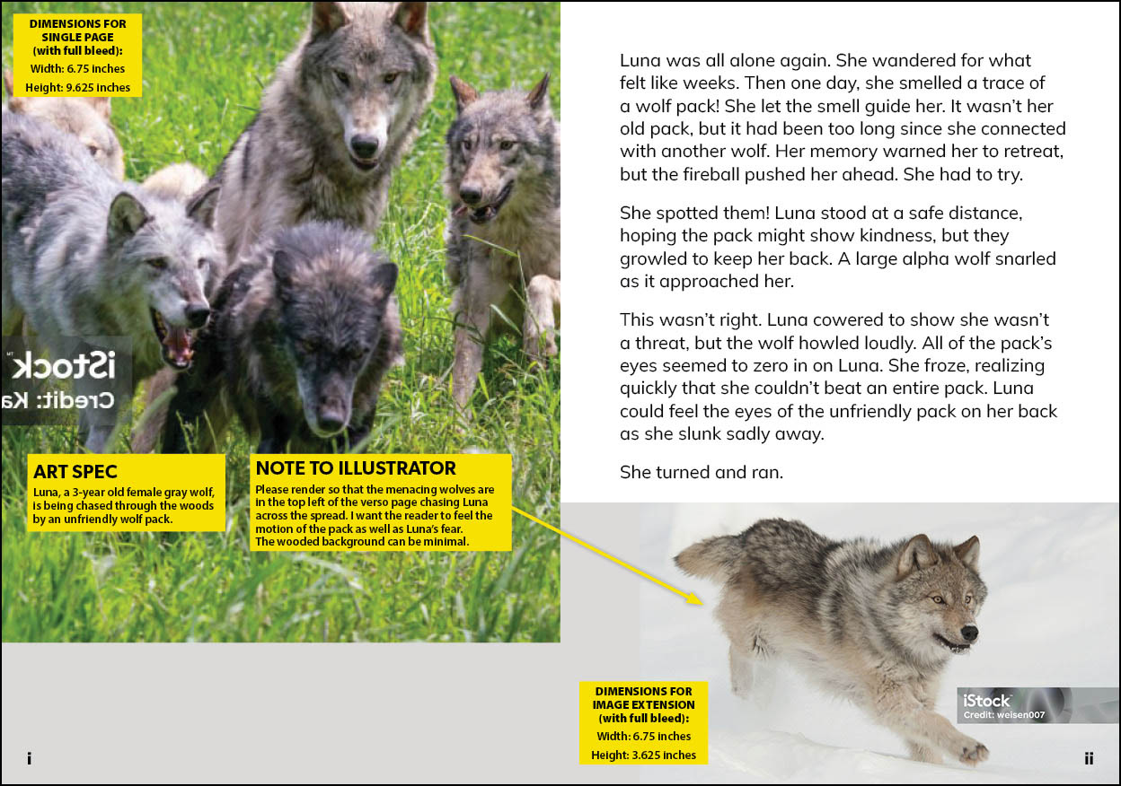
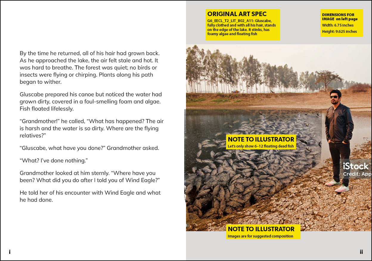
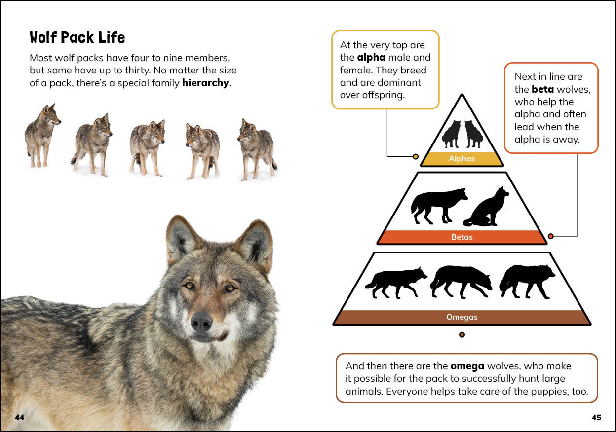
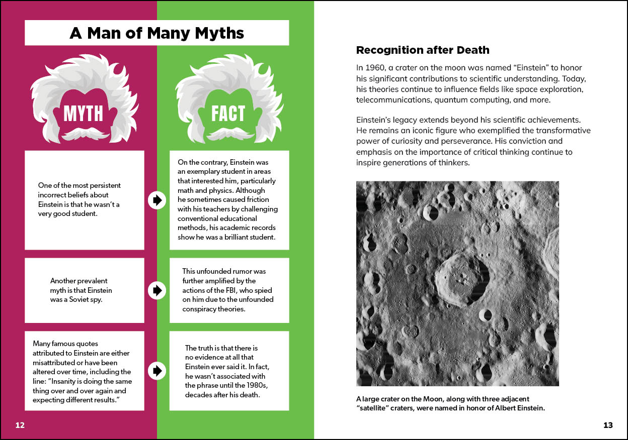
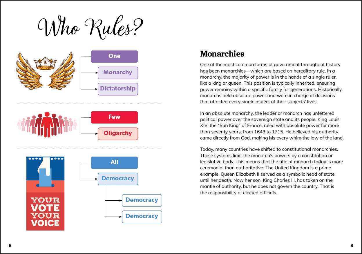
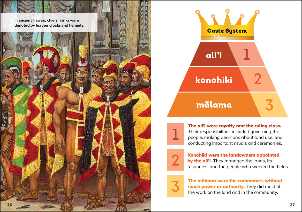
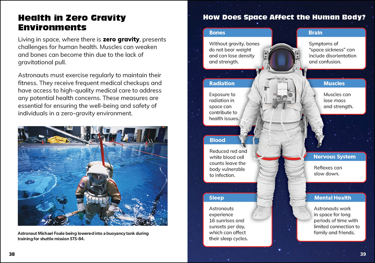
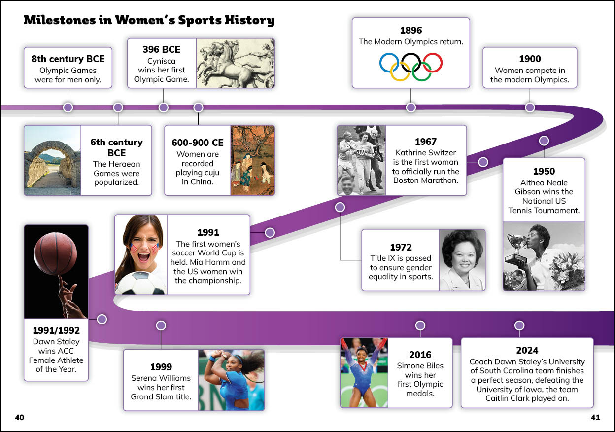
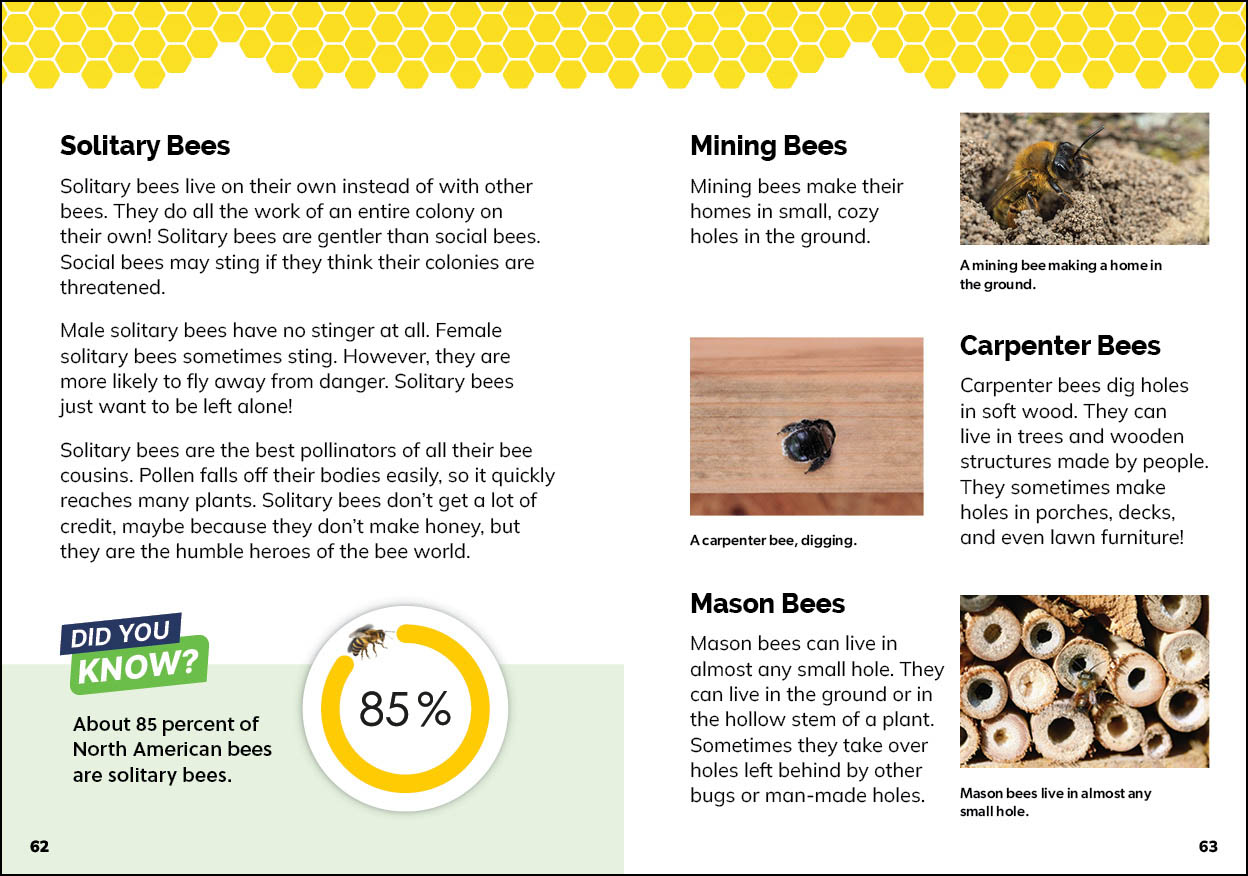
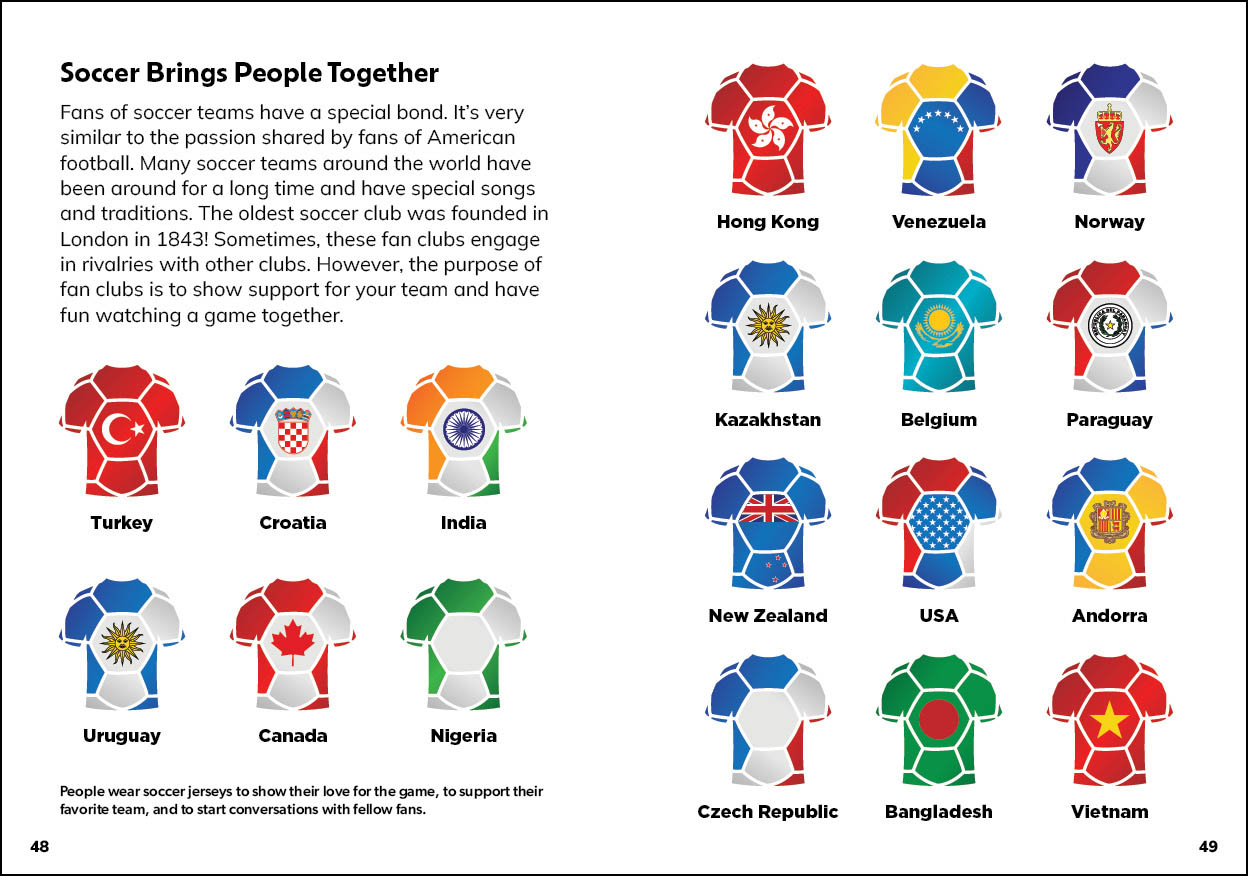
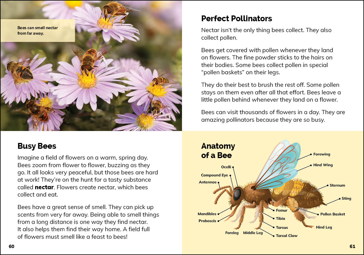
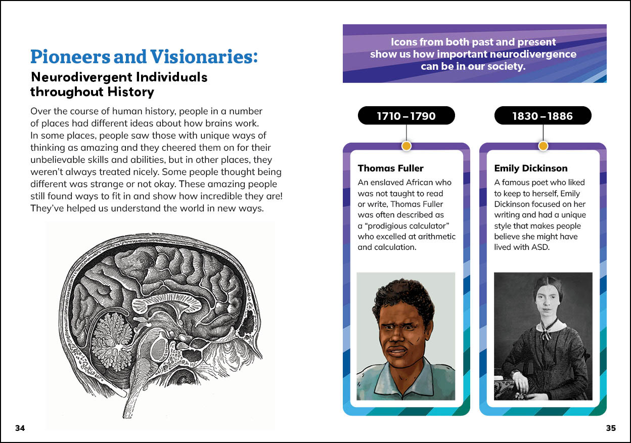
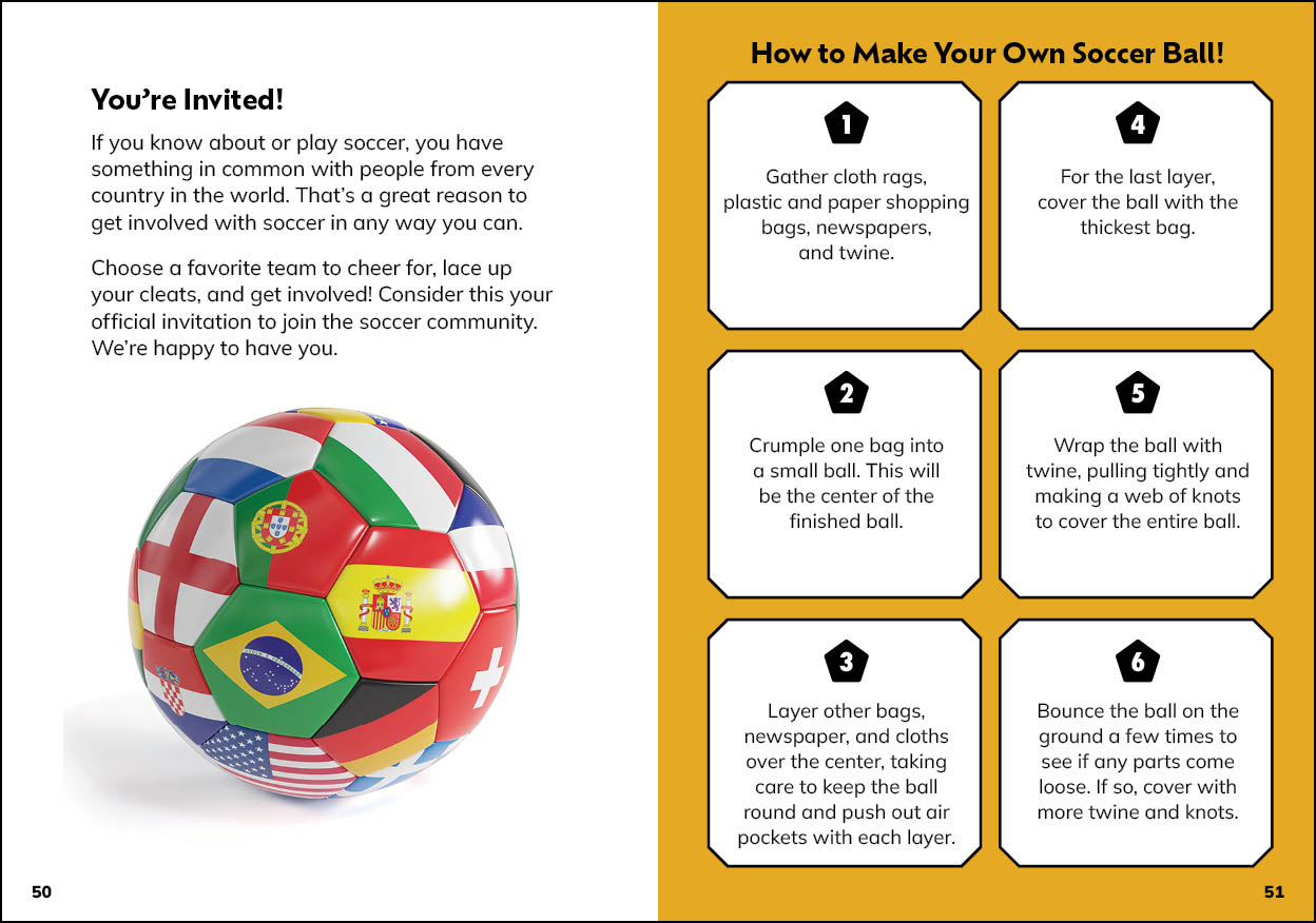
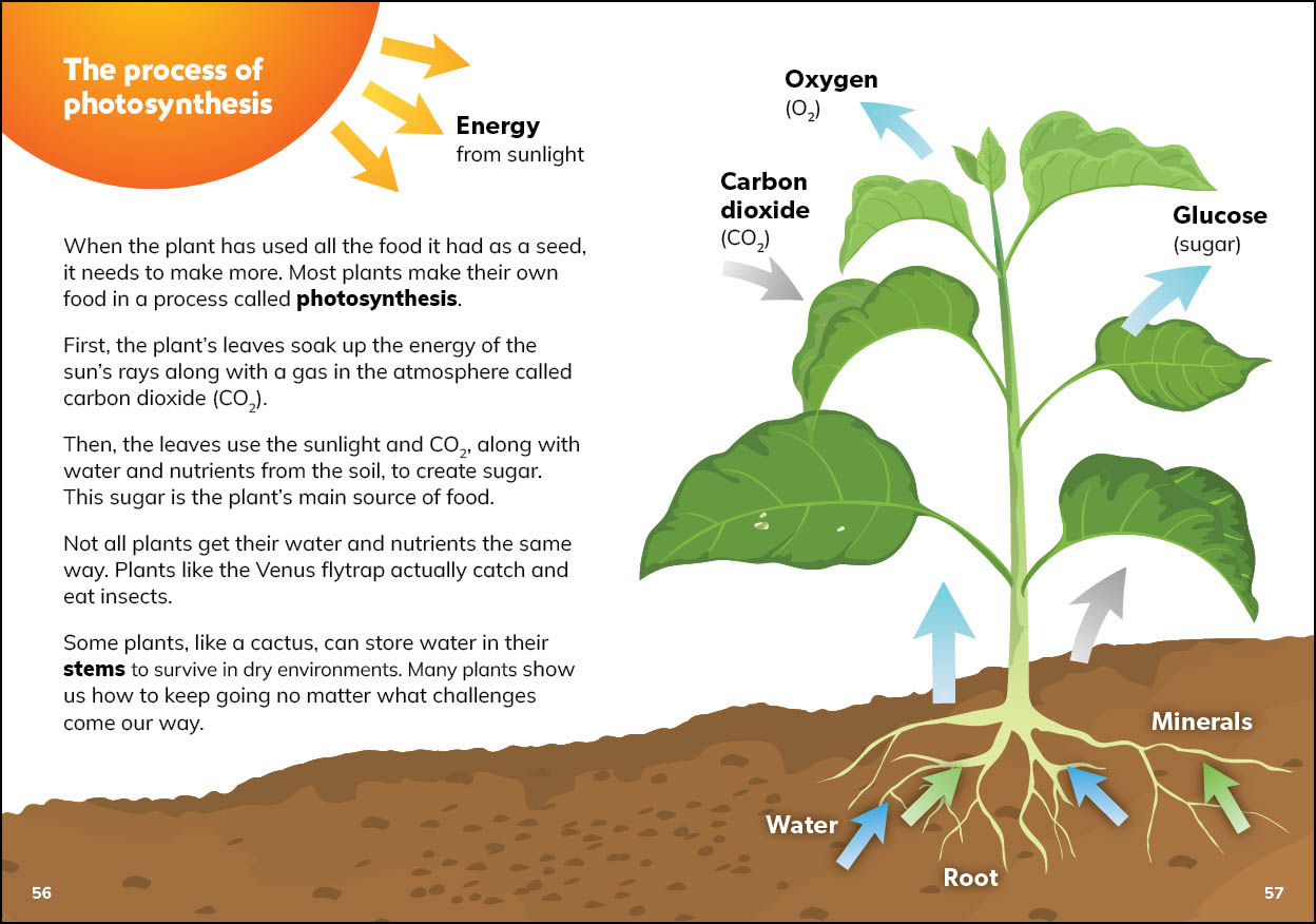
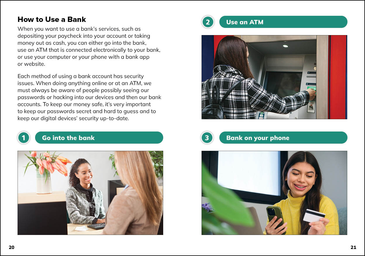
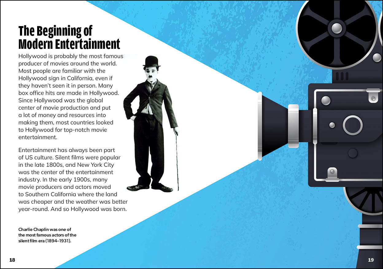
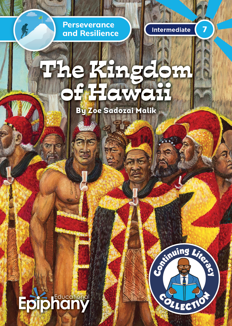
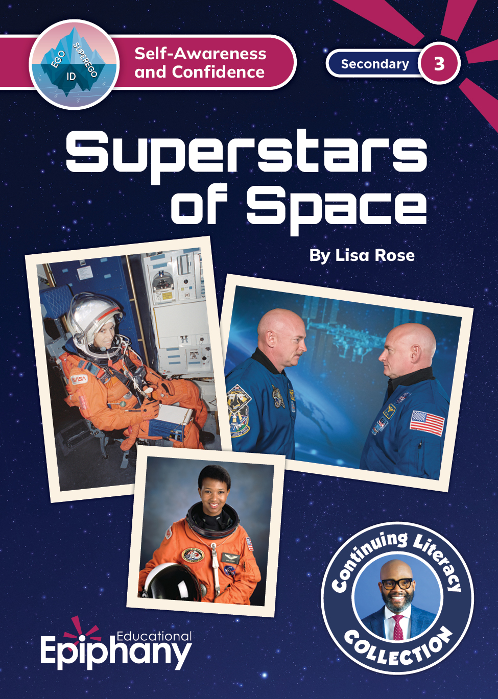
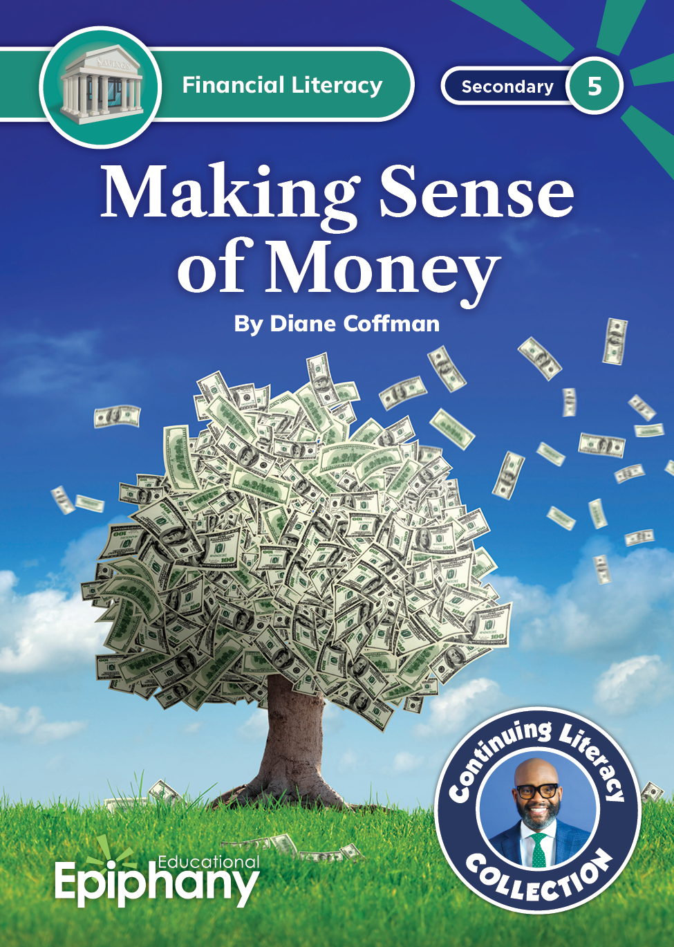
For our informational (nonfiction) books, which included biographies, historical memoirs, personal essays, and speeches, we decided to use a combination of photography and data graphics. I provided intiial art specs to the photo research team which I then supplemented with additional stock imagery that I sourced. I also created infographics and timelines to engage students. Here are a few of my favorites.
Cover Design
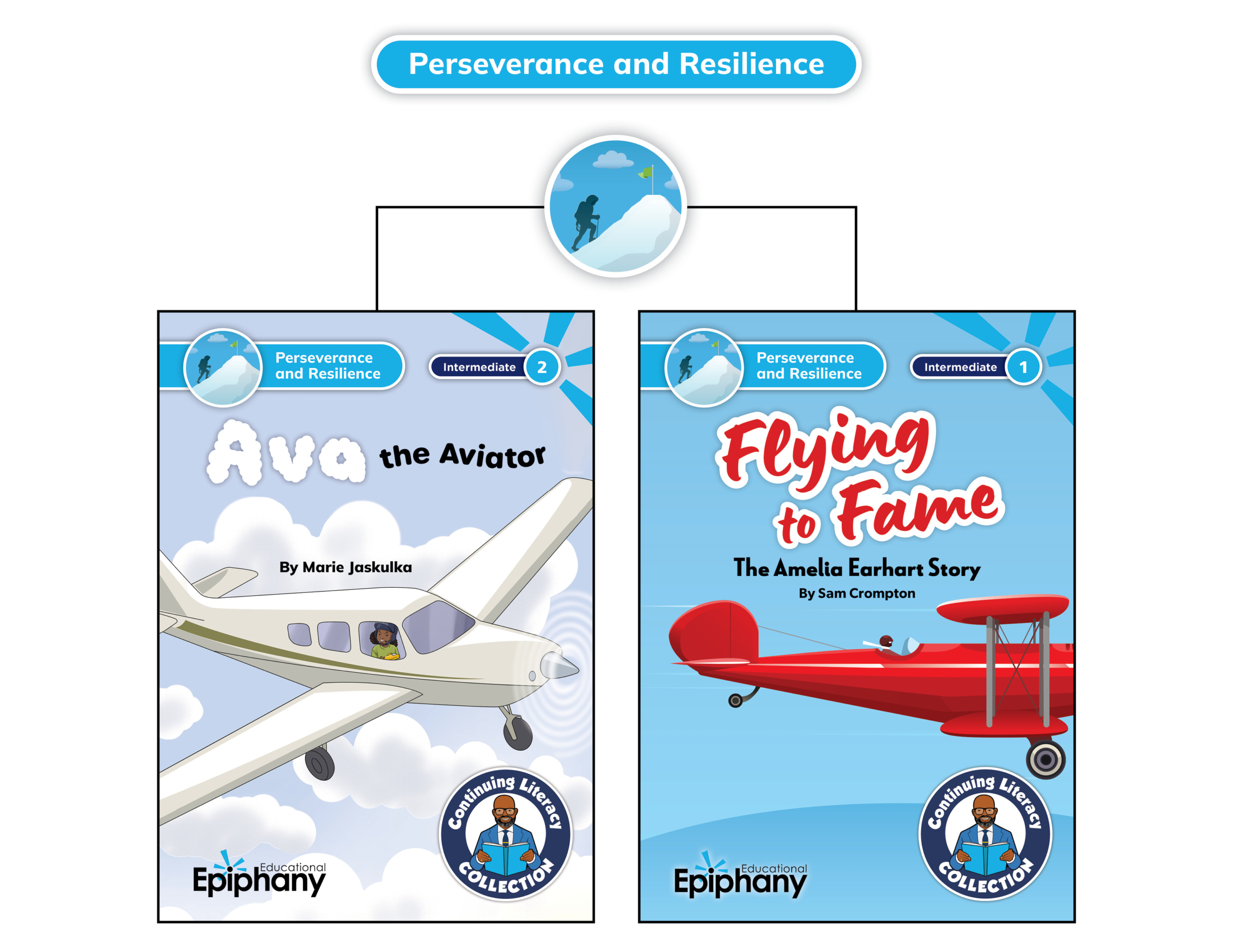
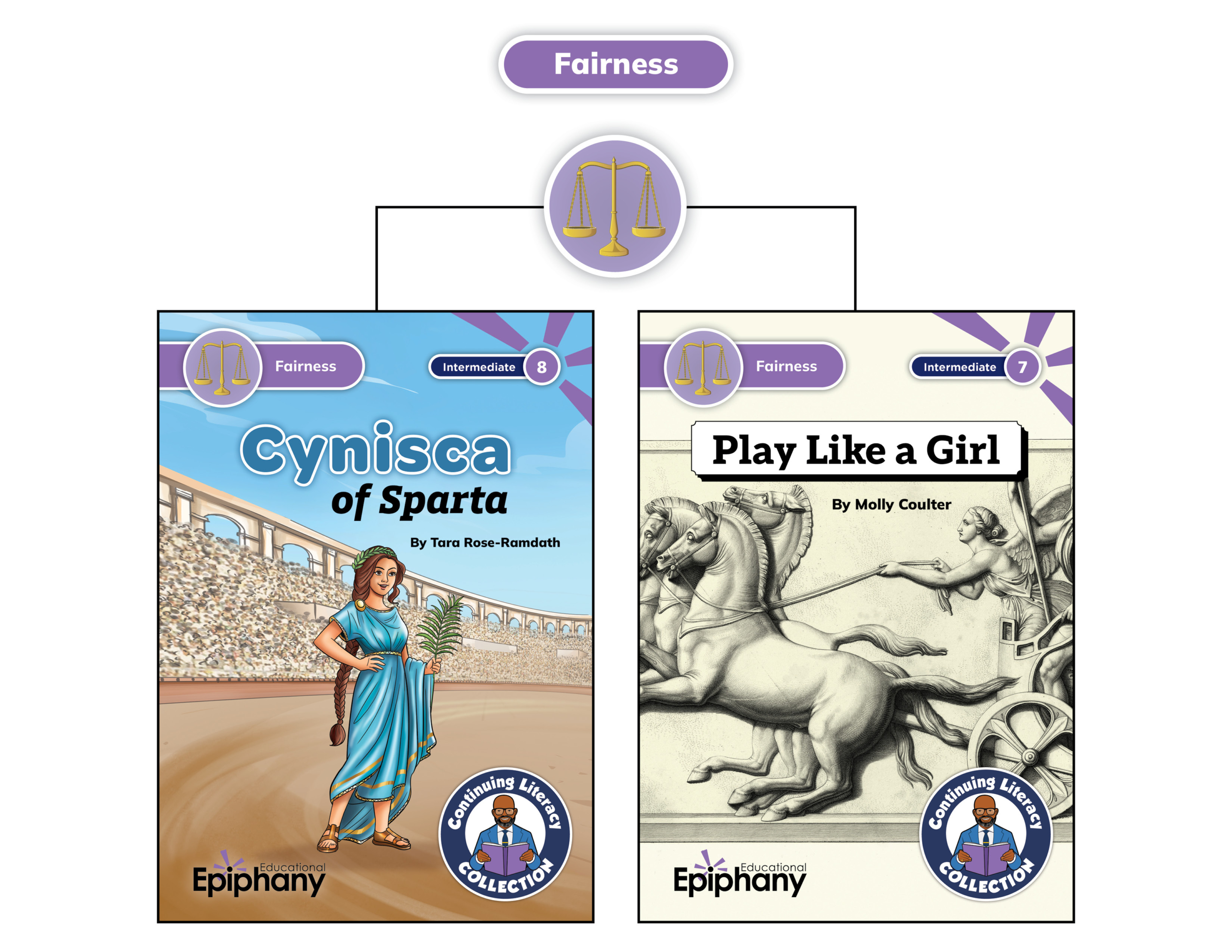
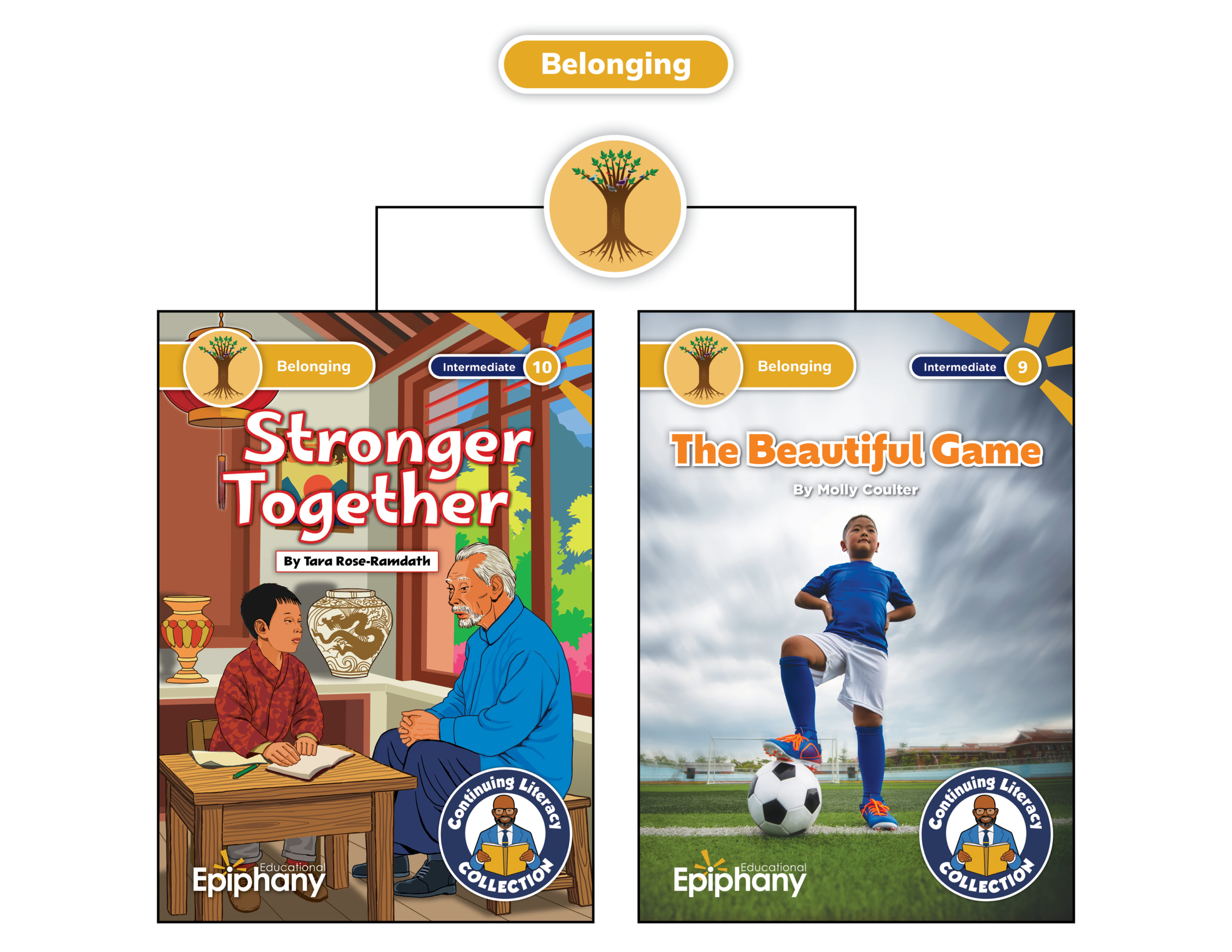
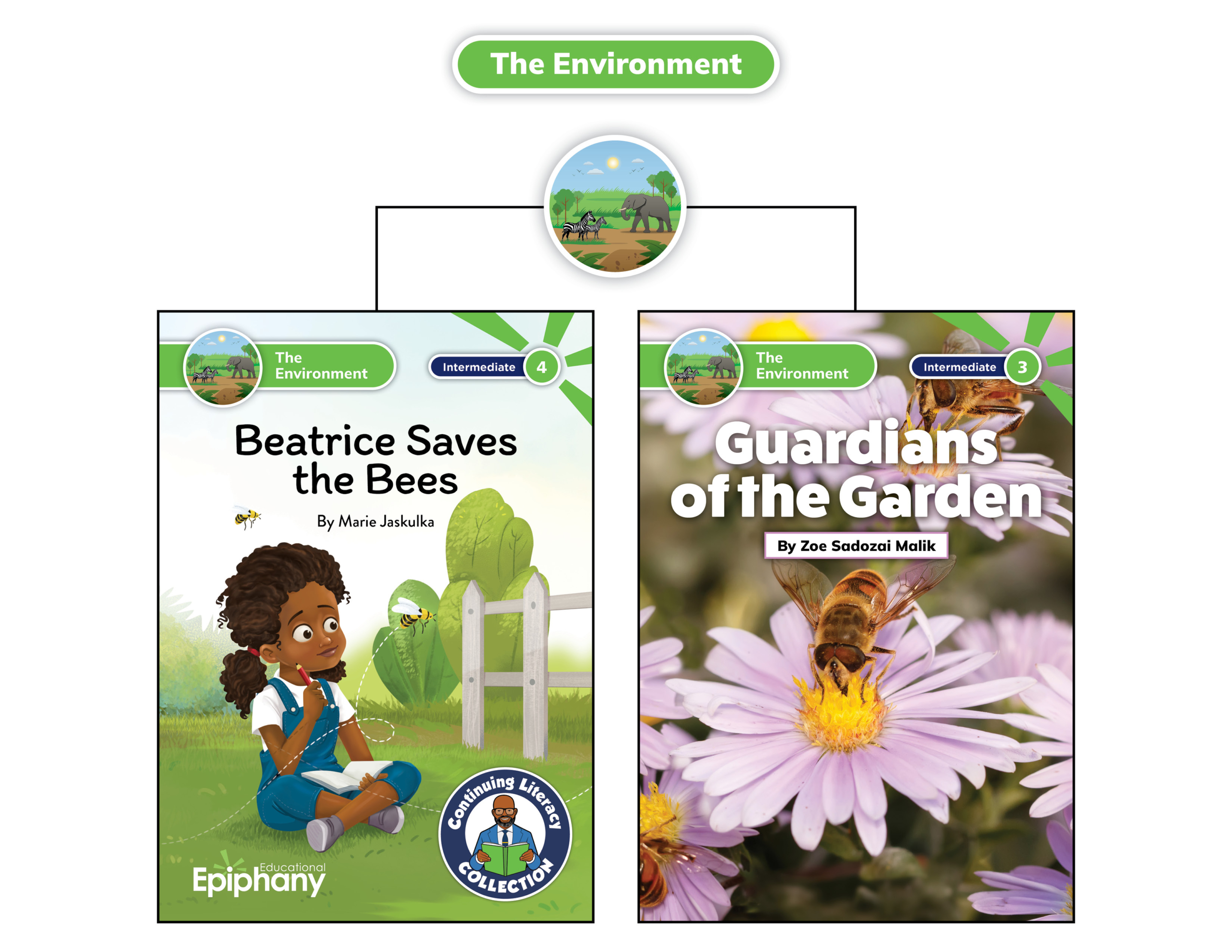
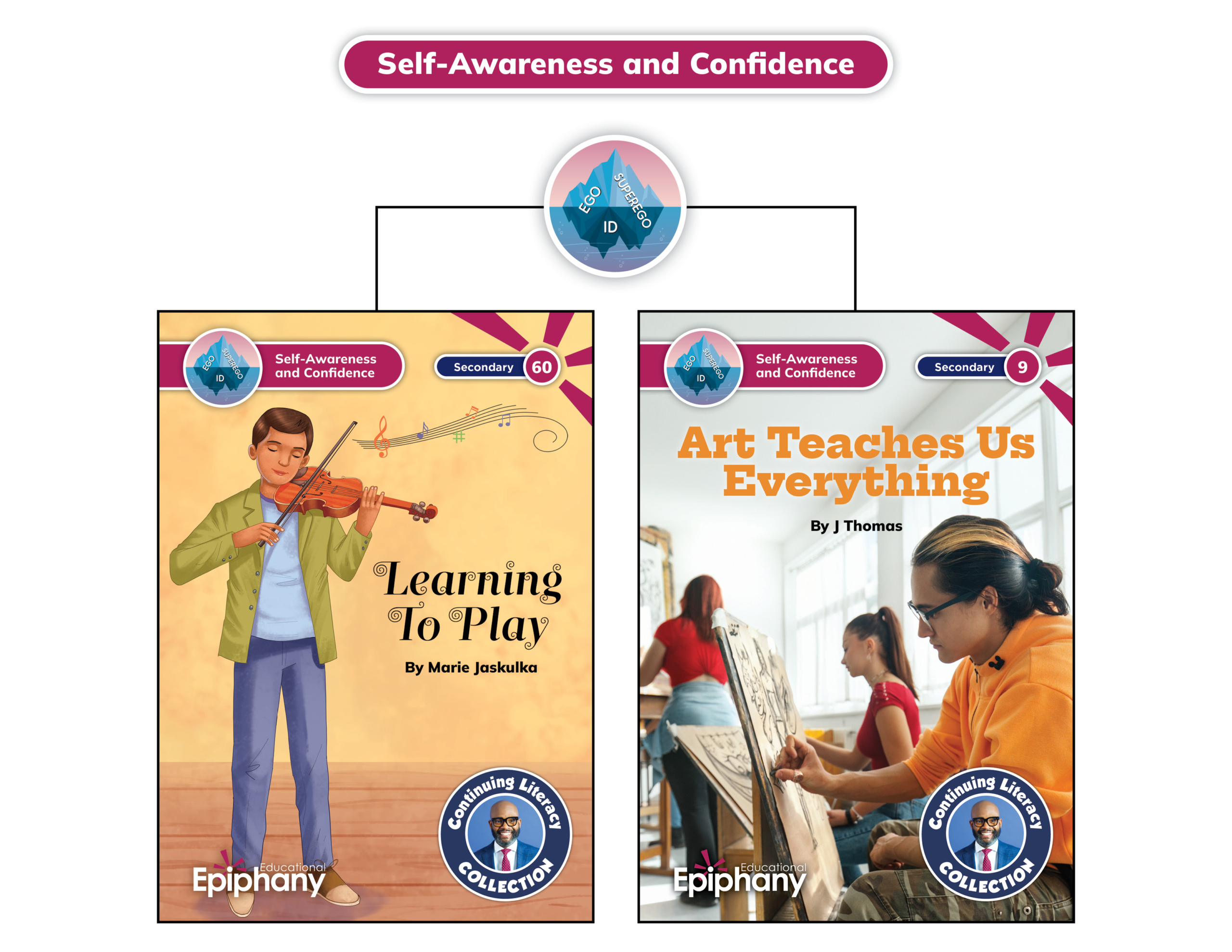
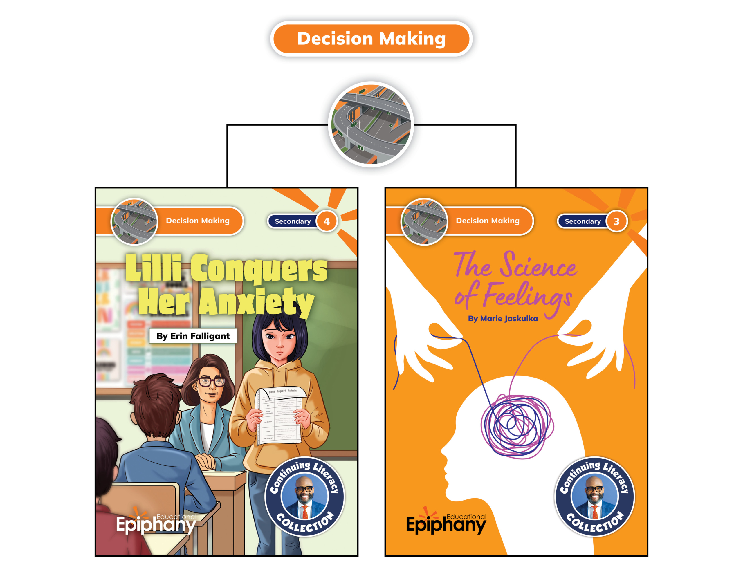
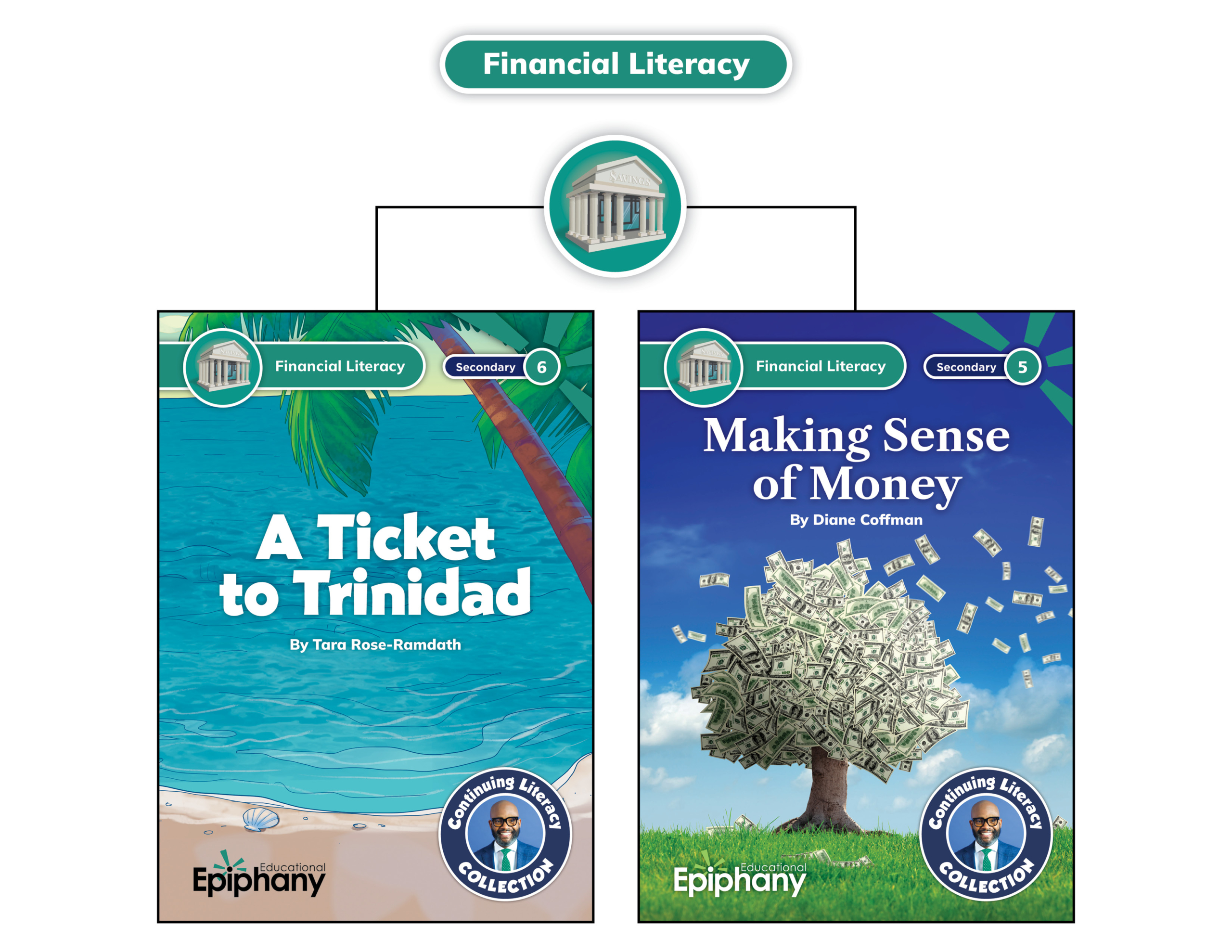
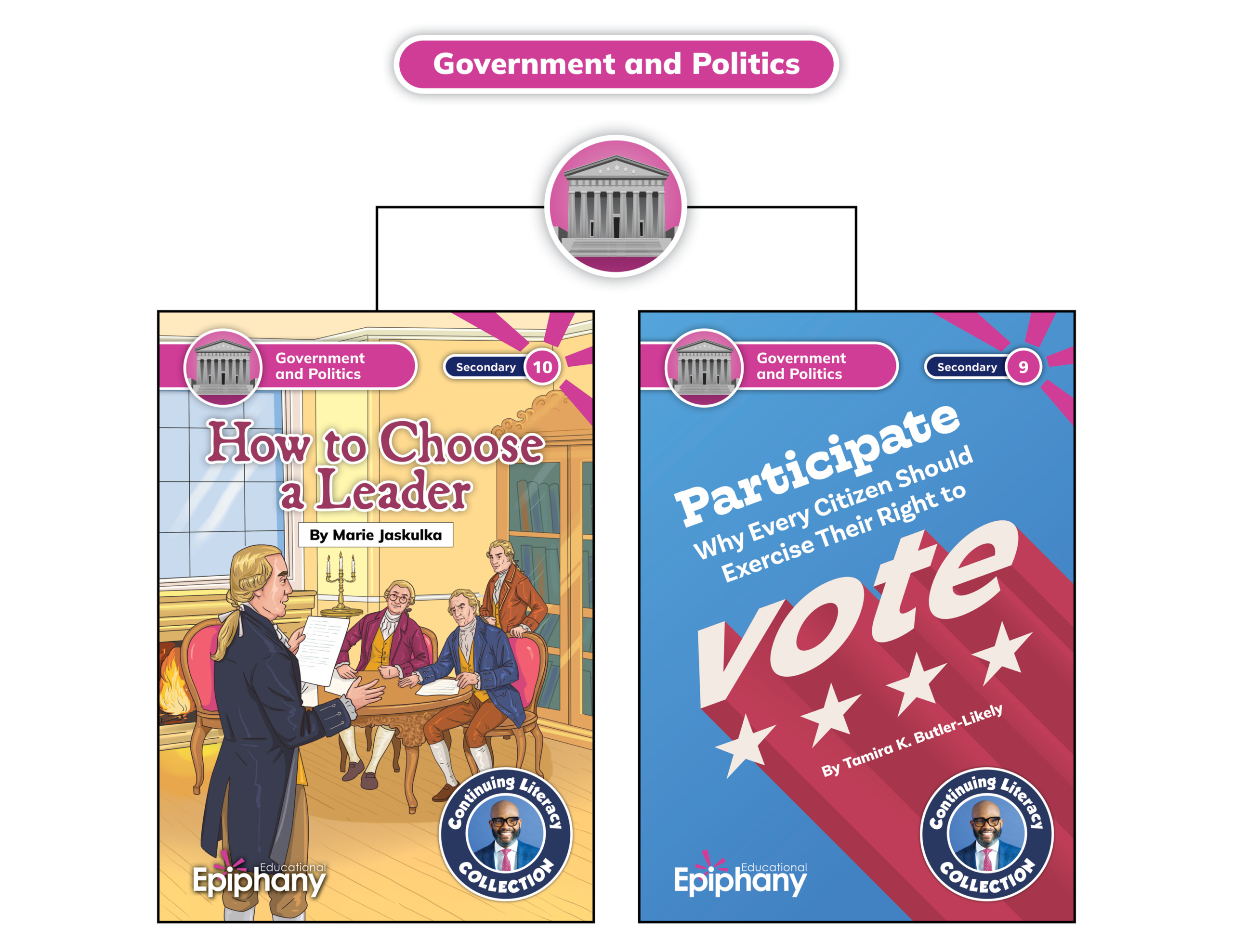
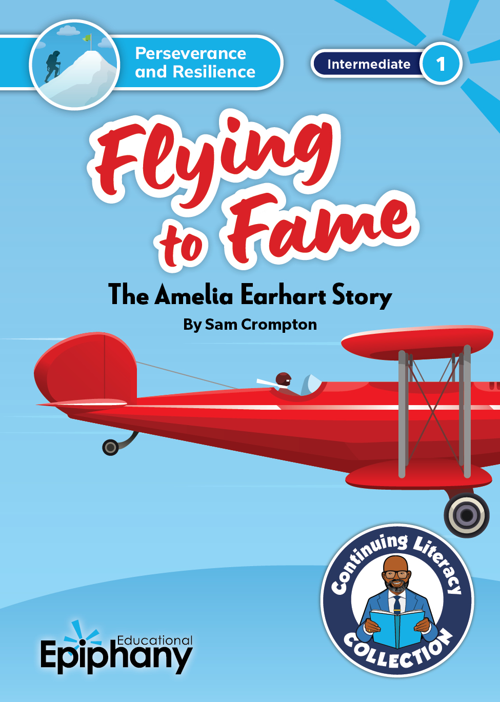
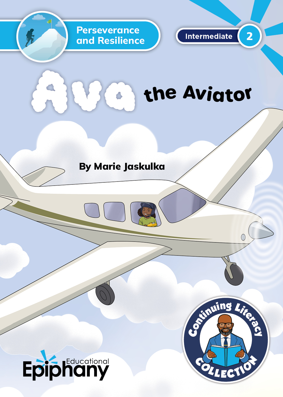
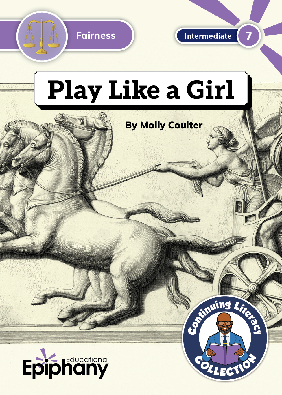
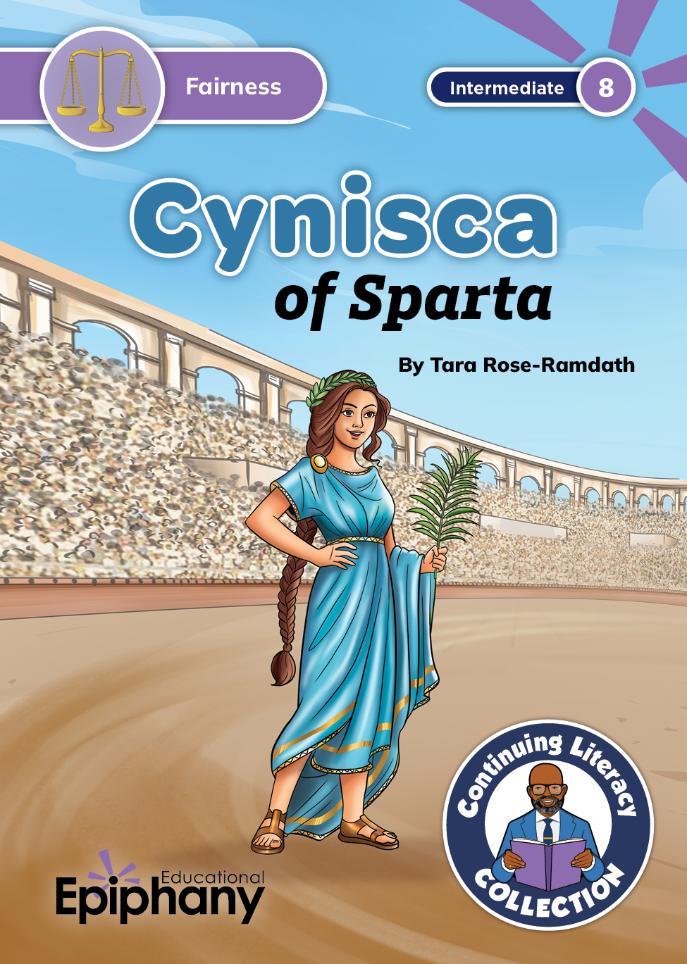
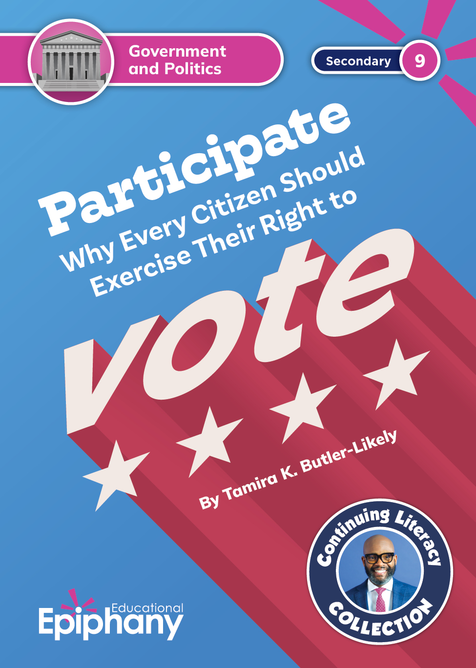
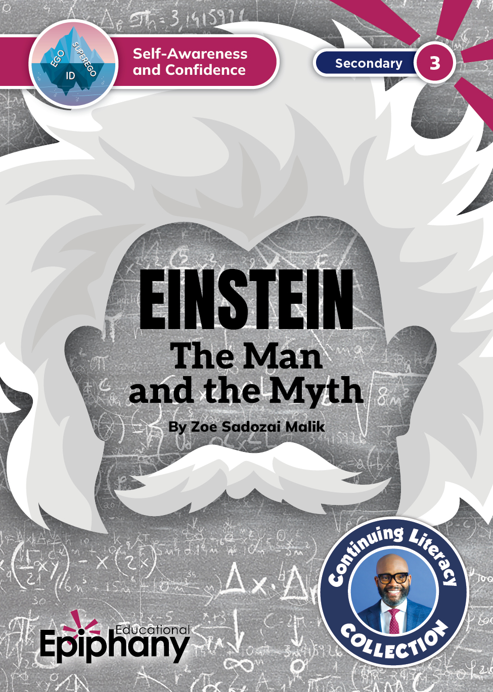
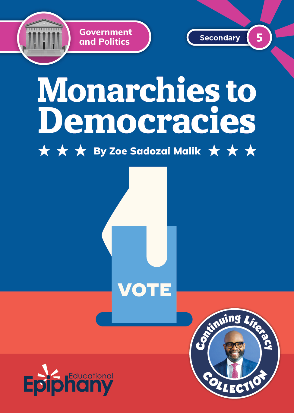
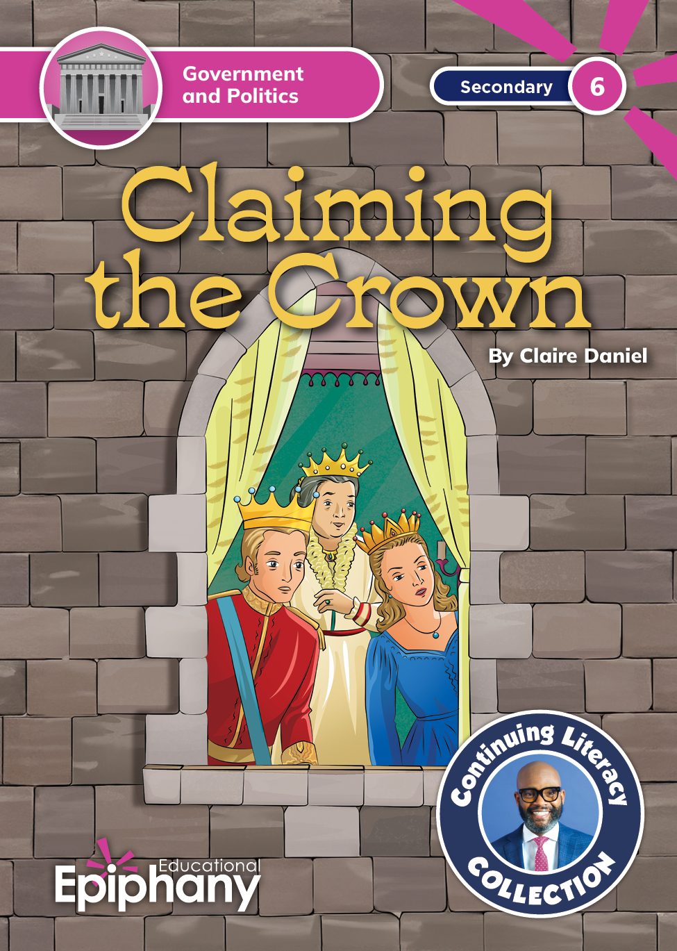
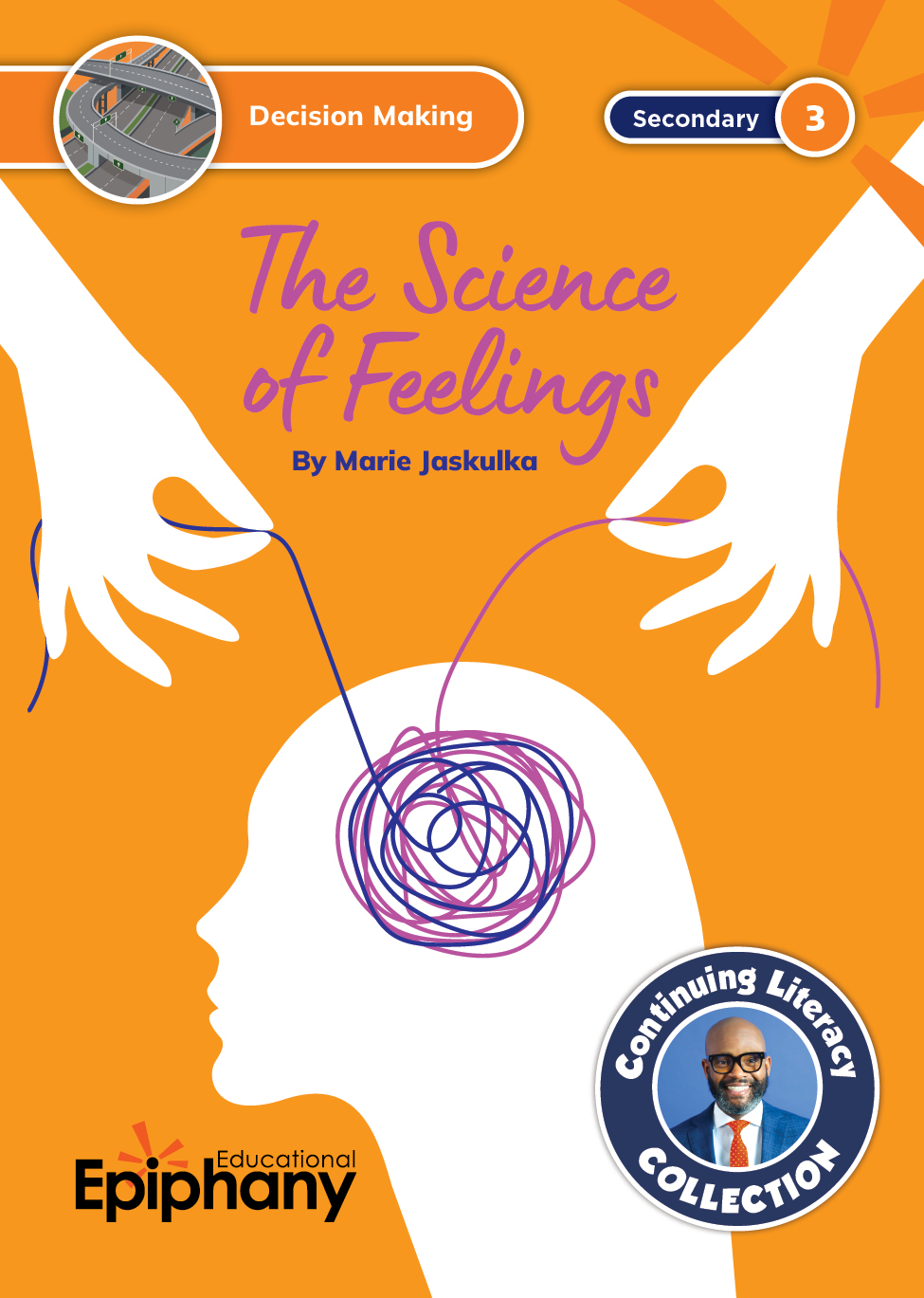
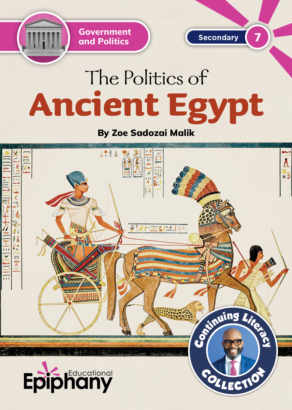
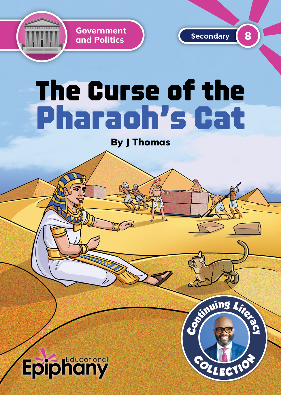
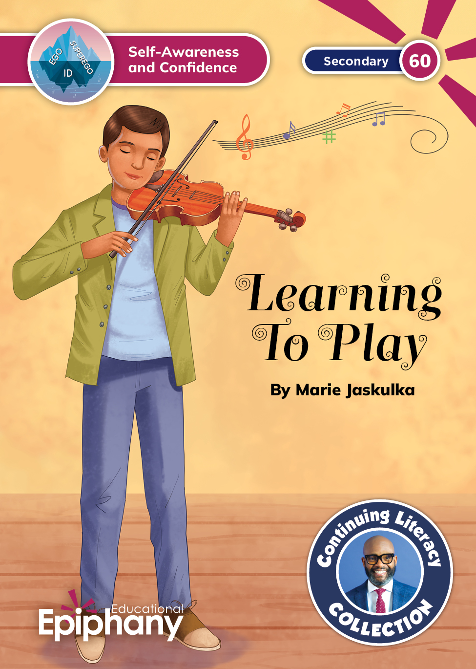
There was no additional money in the budget for cover art, which left me with the challenge of repurposing images from the interior of the books. Thank goodness for Photoshop’s generative-expand and content-aware fill features! I could not have done it without Adobe’s help. Here are a few of my favorite covers.
