Can design rescue a struggling product?
The Challenge:
Carnegie Learning Middle and High School Math Solution received one of the highest rankings from EdReports, but sales were underwhelming. Although the content had received accolades, the visual presentation was off-putting to teachers and administrators. Customer feedback indicated the product was ‘scary’ and ‘not attractive’.
The Product Development team hired me to rethink their student and teacher materials with the goal of making the curriculum more accessible and engaging. Specifically, they wanted me to “challenge their assumptions and biases” as we evolved the existing content into a functional and beautiful design system.
My Solution:
- establish clear information architecture
- reorganize existing content to reduce frustration
- add clear instructional labels and directional design elements
- define visual building blocks and assets that were put in use across the entire product ecosystem
- create an intentional connection between print, adaptive software, and assessments
- redesign the Front Matter to leverage the Carnegie Learning brand
- reduce overall page count by 15%
I resolved all customer pain points identified in user research by redirecting the flow of information in a way that was easy to navigate, made sense, and was consistent with the brand. Not only was the client thrilled with the results, the middle school curriculum earned a perfect score from EdReports.org.
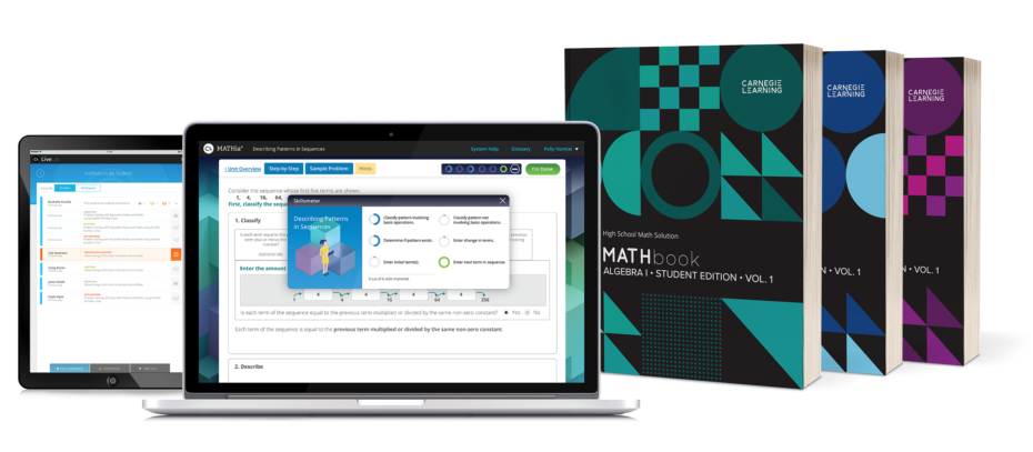
After a thorough review and analysis of the existing product, I redesigned the content to include:
- enhanced navigation
- a consistent design system for repeating content elements
- an intentional connection between textbook and software
- mathematical concepts identified at point-of-use
- increased white space for student practice
- consistent styles and symbols for math typesetting
- specifications for technical art
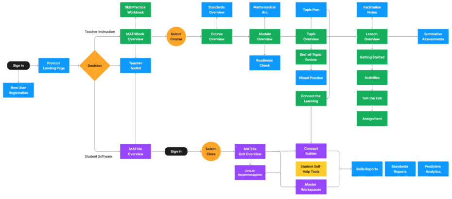
User Journey
To better understand the instructional routine of the existing curriculum, I mapped the user journey in FigJam. As I followed the sequence and pacing of instruction, I put myself in the shoes of both the teacher and the student, so I could plan the information architecture.
Blended Learning Model
Flexible Teaching. Flexible Learning.
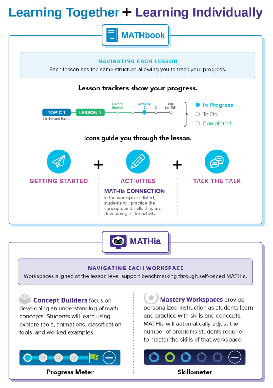
MATHbook (consumable text) + MATHia (adaptive software) work in parallel to engage students with various learning experiences they need to understand the mathematics at each grade level. Over the course of a year, teachers spend approximately:
- 60% of their instructional time teaching whole-class activities (MATHbook)
- 40% of their instructional time monitoring students as they work individually (MATHia)
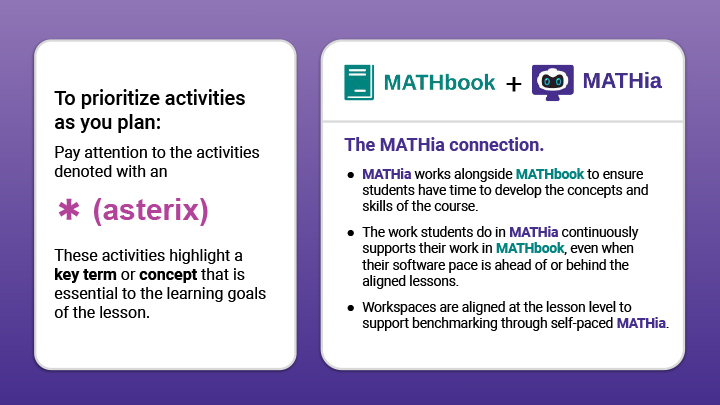
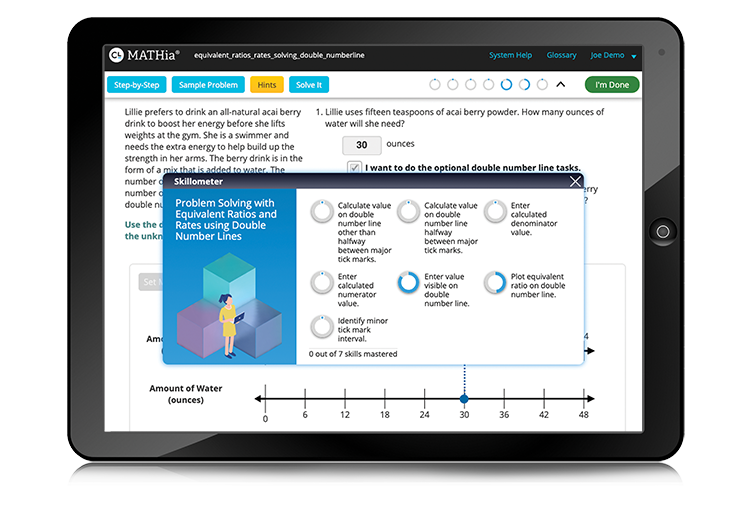
Customer feedback indicated an unclear relationship between the two instructional resources. I combined information architecture with visual design to emphasize the intentional connection between the print and adaptive software throughout the curriculum and help teachers understand how and when to implement each.

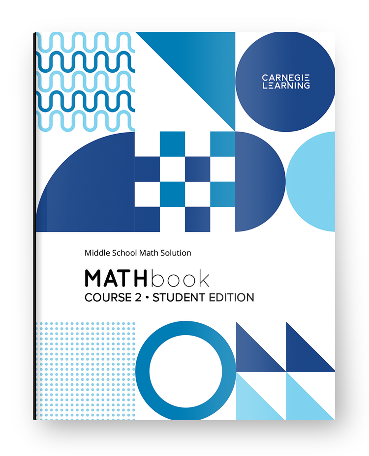
Front Matter
The Carnegie Learning Story
Teachers (and potential customers) are introduced to MATHbook and MATHia in front matter of the Teacher Implementation Guide. These pages provide an opportunity to:
- clearly explain the approach, pedagogy, and content elements found in the book
- emphasize the blended model of learning by making an intentional connection between textbook (MATHbook) and software (MATHia)
- step-by-step guidance for implementation
- immediately make teachers feel comfortable
- highlight what differentiates Carnegie Learning from a crowded and primarily “traditional” market
- create excitement during the sales process
Teacher Implementation Guide
Lesson Planning
A resource for planning, guiding, and facilitating student learning, these pages provide learning goals and review questions to connect the lesson to prior knowledge.
I incorporated the instructional model (Engage + Develop + Teach) into the page header as a navigation tool to help teachers identify the intent of each section and provide them with everything they need at point-of-use.
- Engage: Read the Module Overview to appreciate the arc of the math
- Develop: Read the Topic Overview and do the math to experience the content development
- Teach: Read the Facilitation Notes and plan learning experiences to meet classroom goals

Also included in each overview:
- aligned standards
- guiding questions to differentiate instruction
- point-of-use support to simplify planning and understanding
Teacher Implementation Guide
Teaching the Lesson
Instructional pages are designed to walk the teacher through each math lesson and provide point-of-use facilitation tools, including suggestions for how to chunk each activity into smaller pieces and strategies for differentiation. A large image (redux) of each student workbook page is surrounded by expert tips for engaging with students and guiding their mathematical development. Instructional strategies and essential ideas are explained for each activity. Once a teacher understands the instructional sequence, they have the flexibility to plan out pedagogical moves in a way that works for their specific classroom.
Teacher Implementation Guide
Facilitating Instruction
I incorporated a lesson tracker into the header of each page to guide students through the lesson and track progress. Facilitation notes to assist teachers with the planning process correspond with the lesson structure, providing differentiation strategies and common student misconceptions to support all students at all learning levels as well as suggestions for extending activities.

Topic Plan
Online Planning
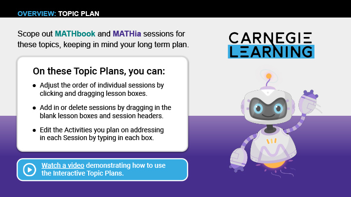
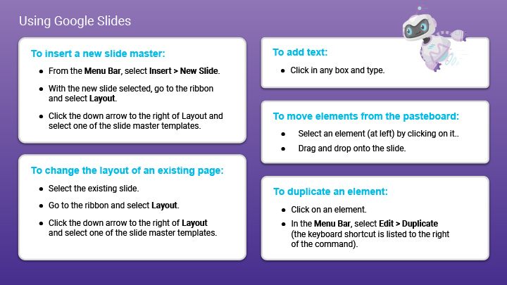
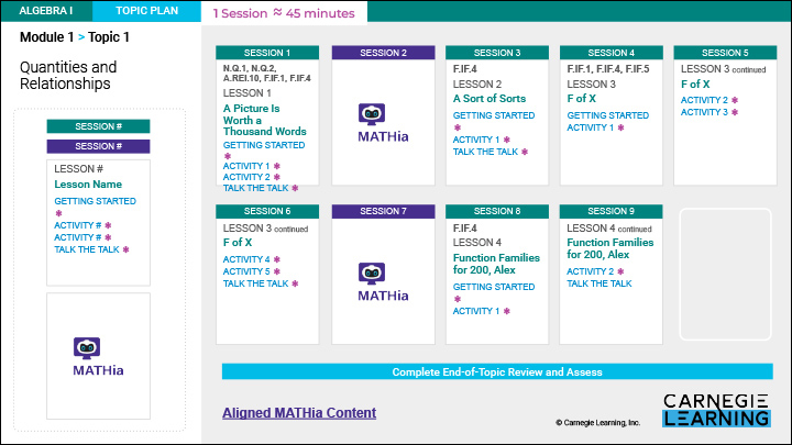
To assist teachers with scoping and planning, I created interactive, drag and drop planners in both Google Slides and Powerpoint.
Teachers are able to add, delete, re-order, and customize sessions as they plan instruction. Links are included to aligned content in the software and training videos.
Visual Models
Technical Art
Visual representations (VRs) are used in mathematics to help students solve problems and understand abstract ideas. I conducted a design audit to identify the math representations required for each subject area, designed a consistent visual language for each representation, and created specifications for the illustrators who would be creating the technical art.
MATHBook
Student Edition
MATHbook is the student’s primary classroom resource recording each student’s thinking, reasoning, and problem-solving. Students learn new math concepts by collaborating, creating, communicating, and problem-solving together with their peers. Lessons interweave instruction, questions and worked examples to engage students as they develop their mathematical understanding. The assignment at the end of each lesson provides opportunities for students to practice and apply their knowledge of mathematics learned.
Lesson pages contain intentional connections to the adaptive MATHia software where students can work independently and receive just-in-time support for the math concepts they are learning.
